crossperience
Brand identity / Graphic design
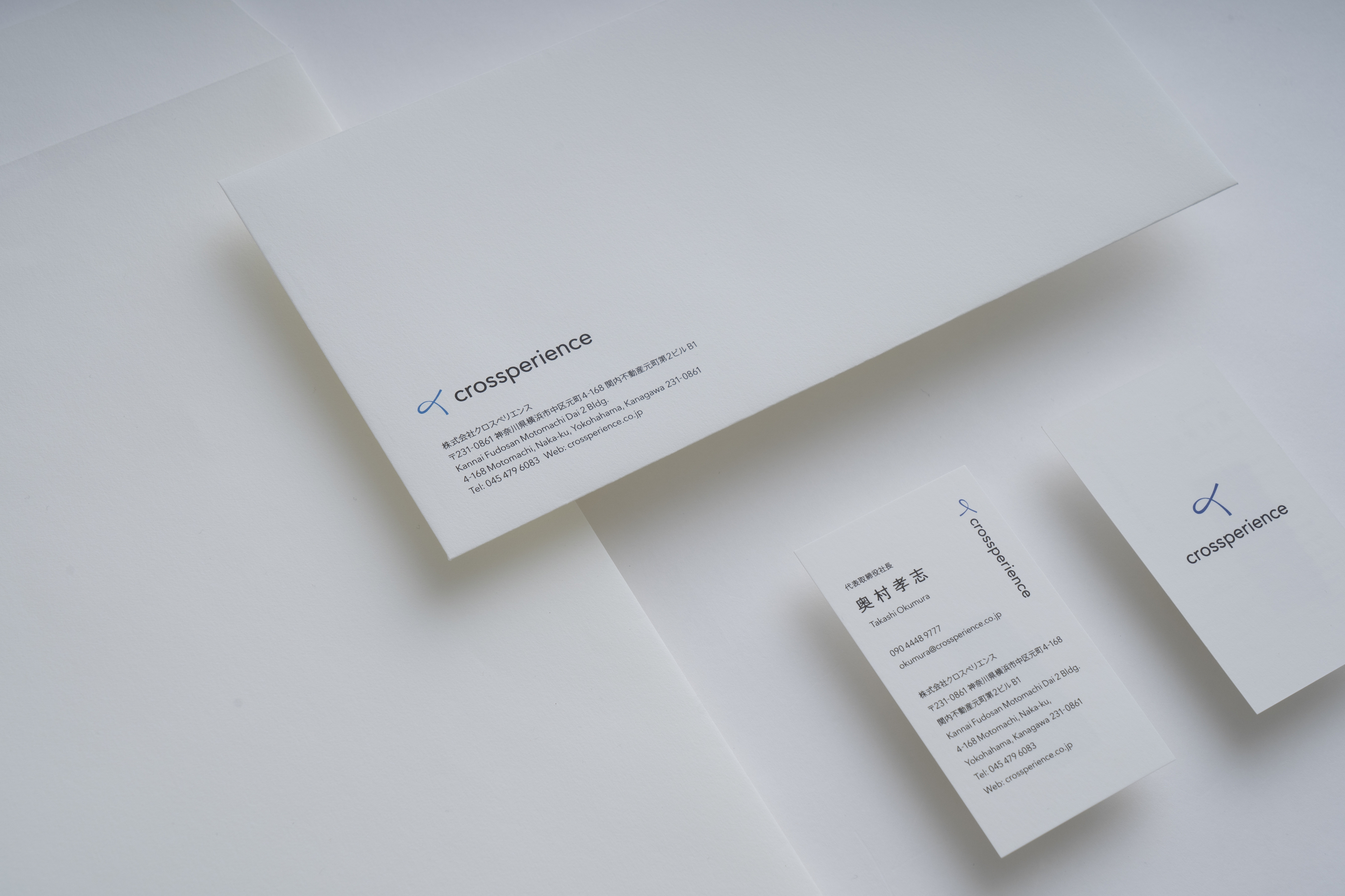
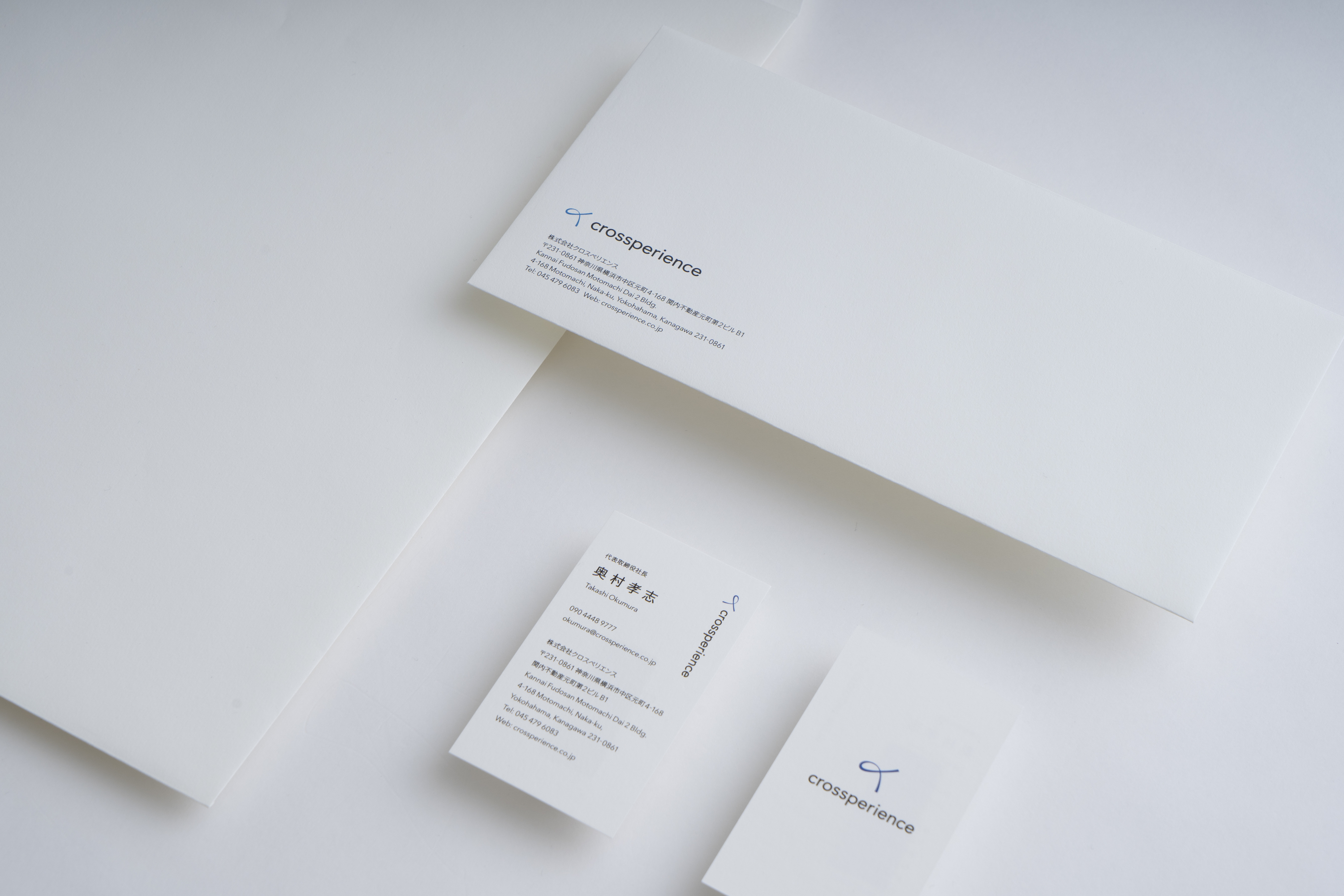
企業の人材育成/派遣、アニマルセラピーおよびセラピスト育成のサービスを提供している、株式会社クロスペリエンスのヴィジュアルアイデンティティを担当いたしました。社名は、領域を横断しながら、唯一無二の価値や体験を提供したいという思いを込め、Cross と Experience を掛け合わせた造語です。
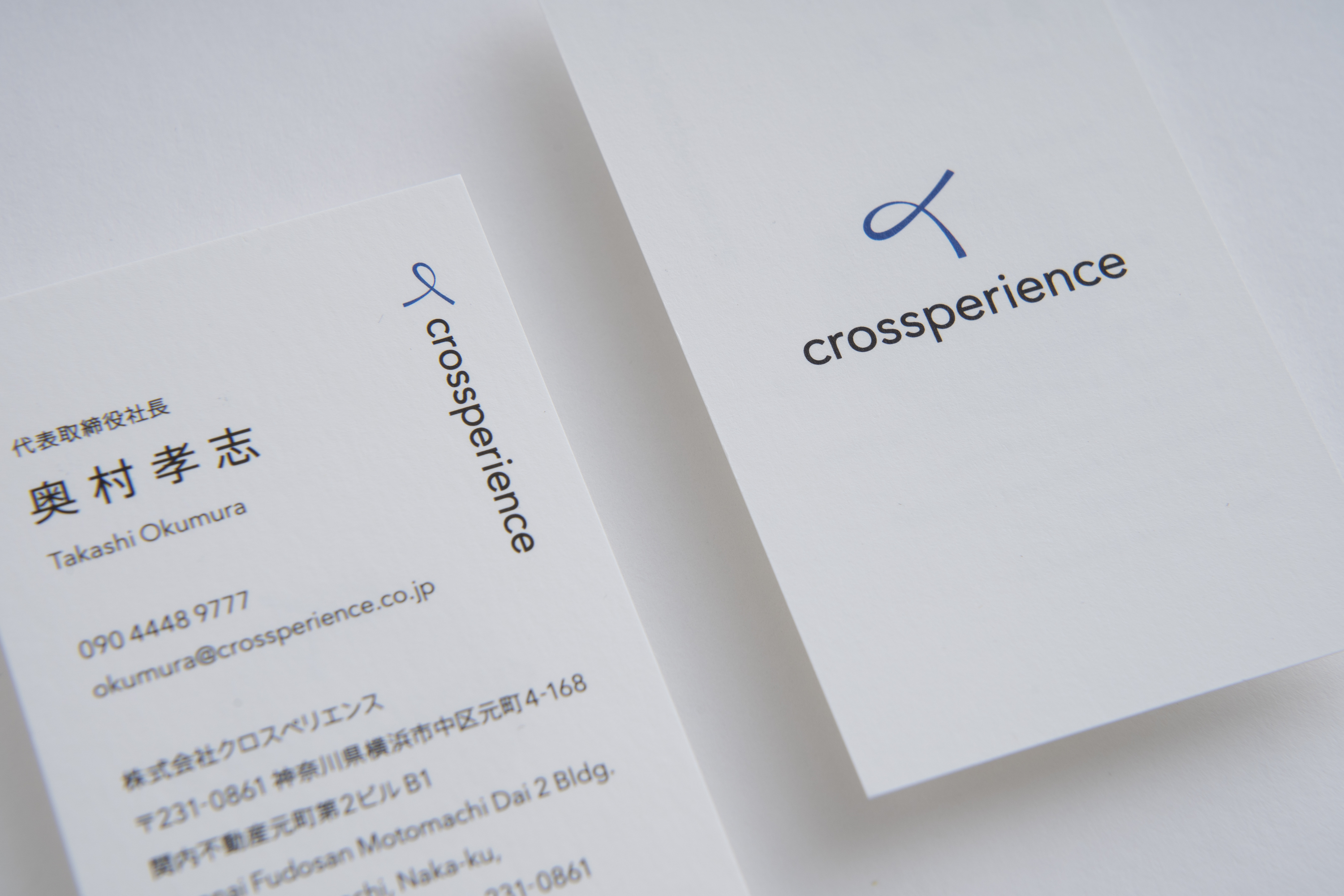
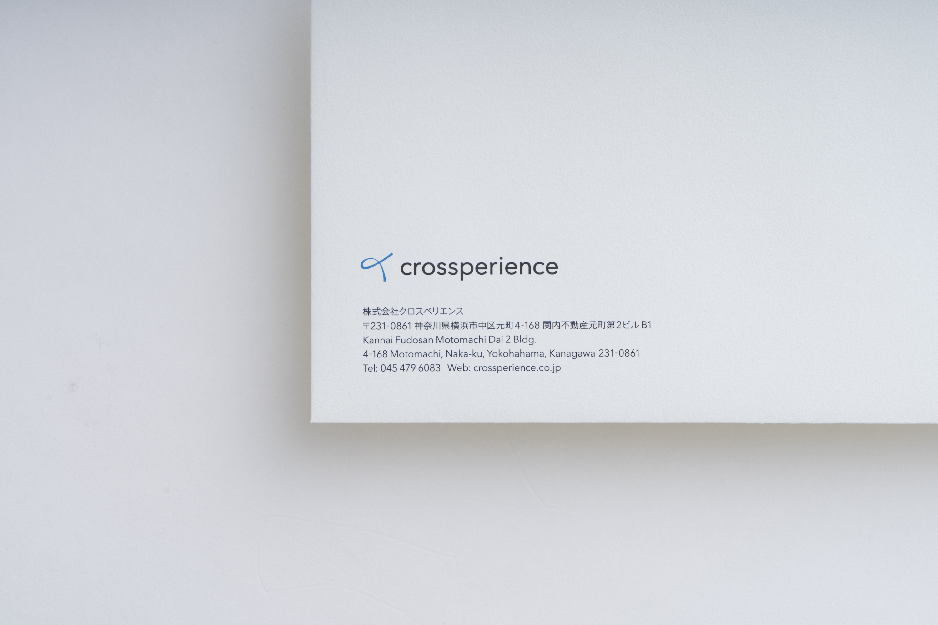
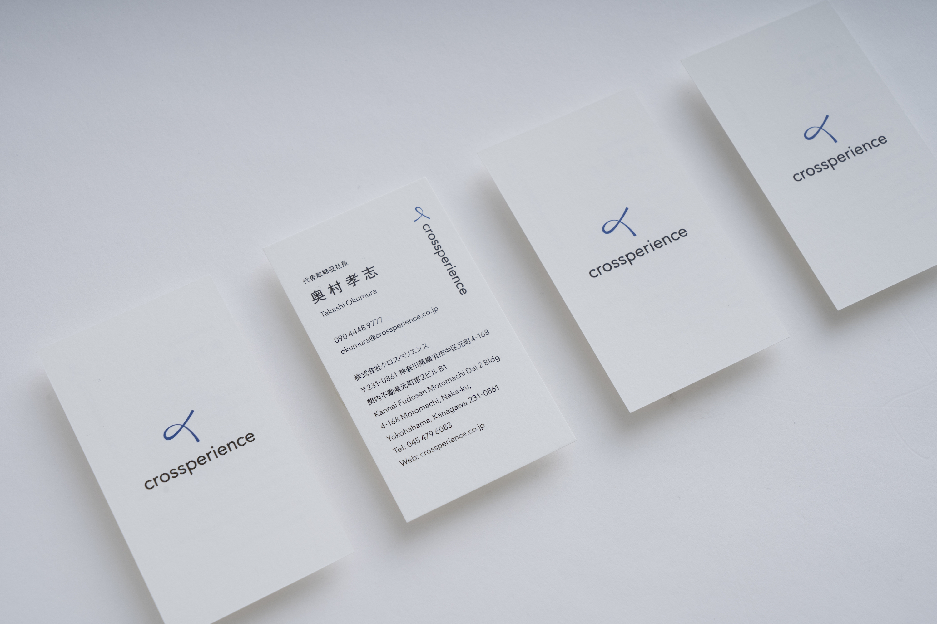
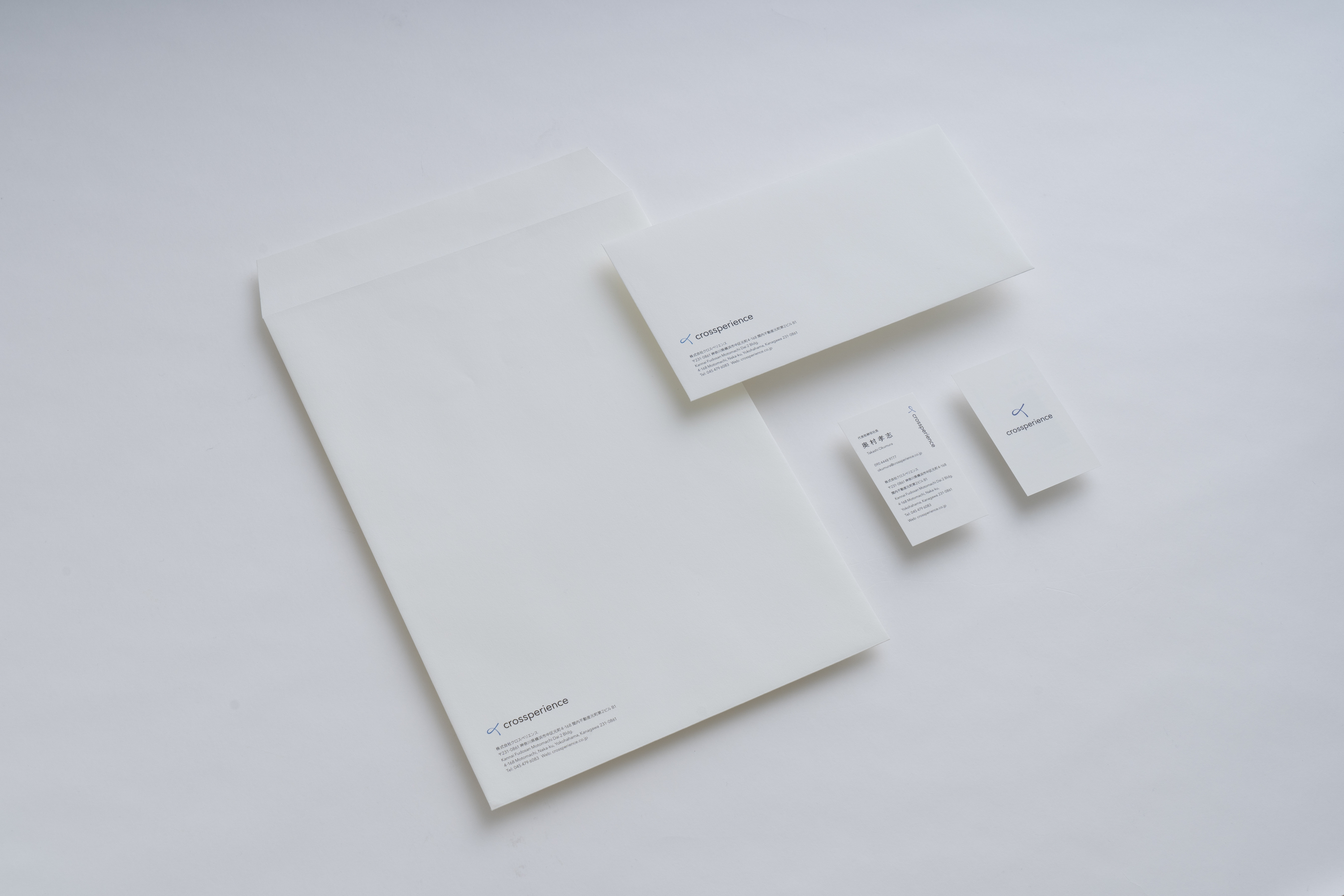
人(文字)、結び、クロス、幸運(Fingers Crossed)を表現したロゴマークとオーソドックスながらも柔らかい印象のあるタイプフェイスを組み合わせたロゴデザインです。
one inc. was in charge of the visual identity of crossperience Inc., a company that provides corporate human resource development/dispatch, animal therapy, and therapist training services. The company name is a coined word that combines the words "Cross" and "Experience" to express the company's desire to provide unique values and experiences across domains.
The logo design combines a logo mark representing a person(Chinese character), a knot, a cross, and fingers crossed with an orthodox yet soft impression typeface.
Creative direction and design consulting: one inc.
Design: Kazuki Kaneko