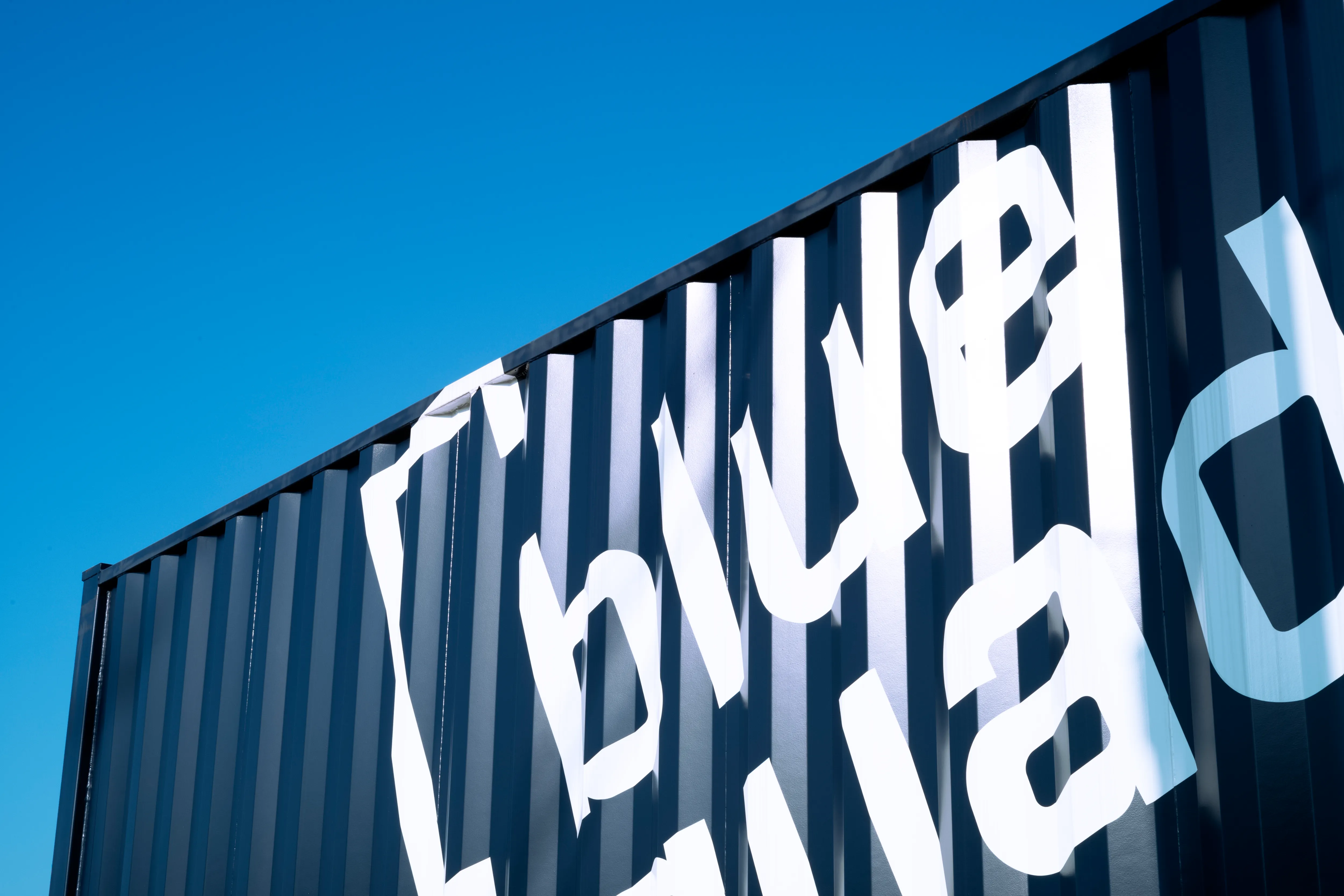
blue quad hotel
Naming / Brand identity / Typeface / Wayfinding
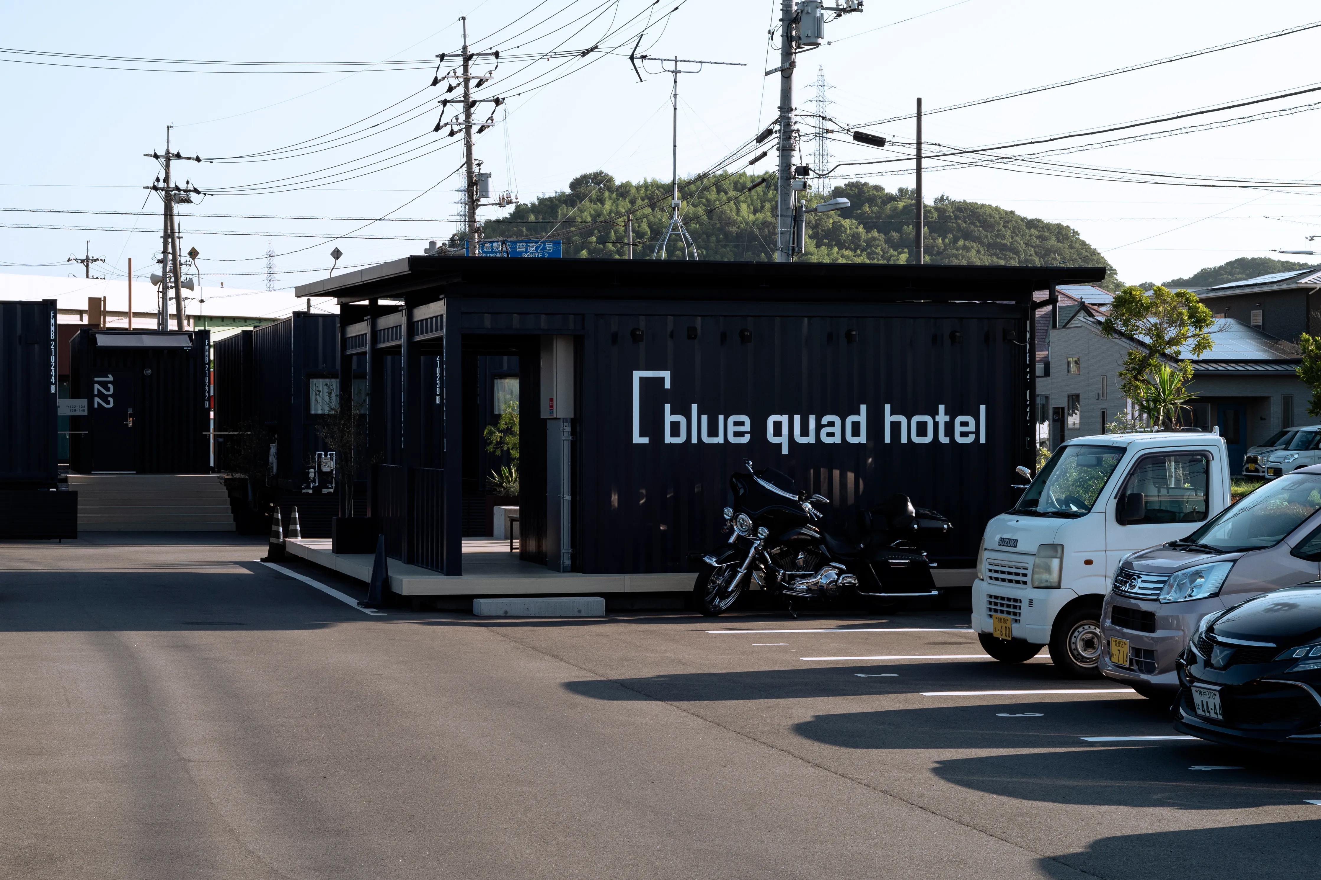
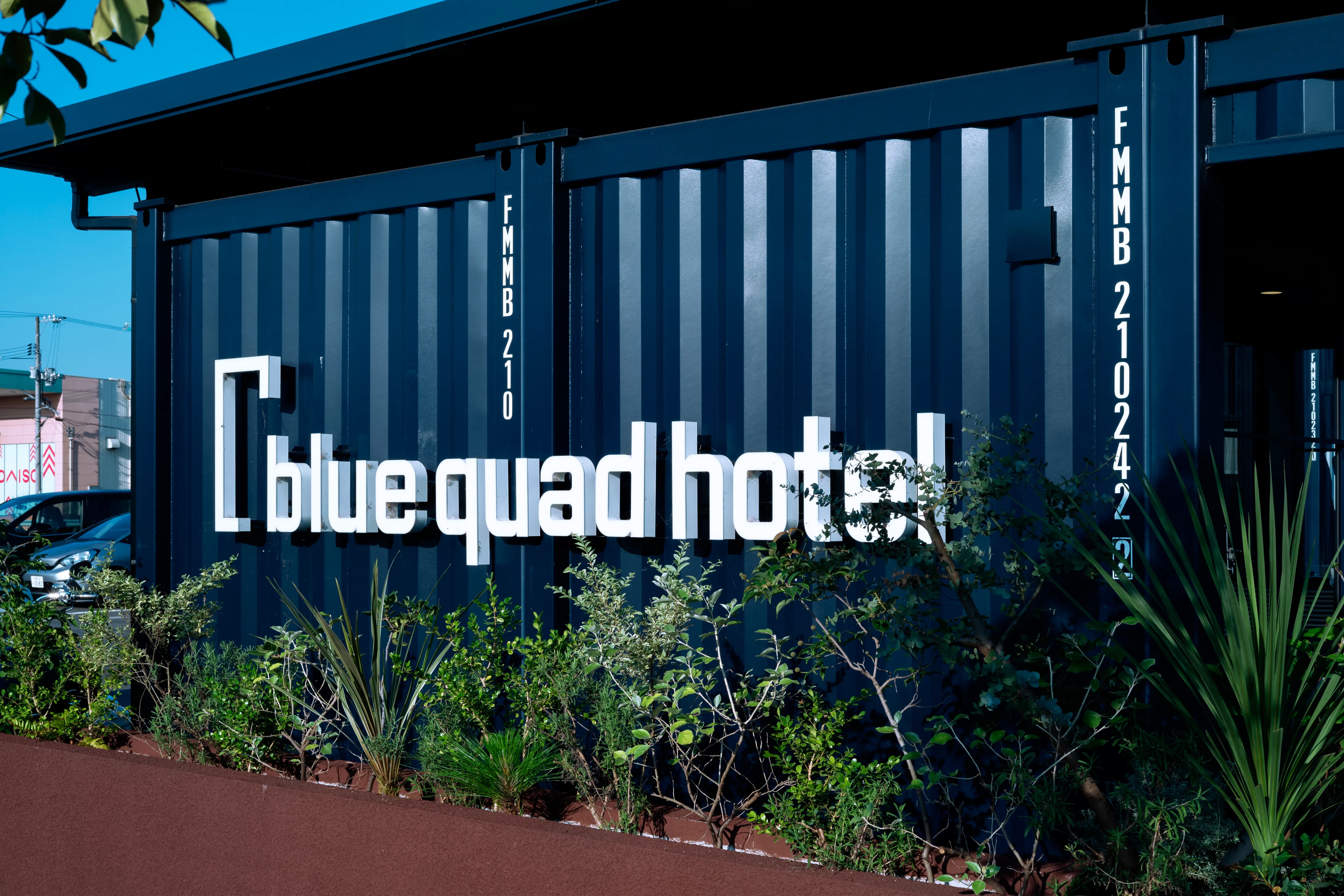
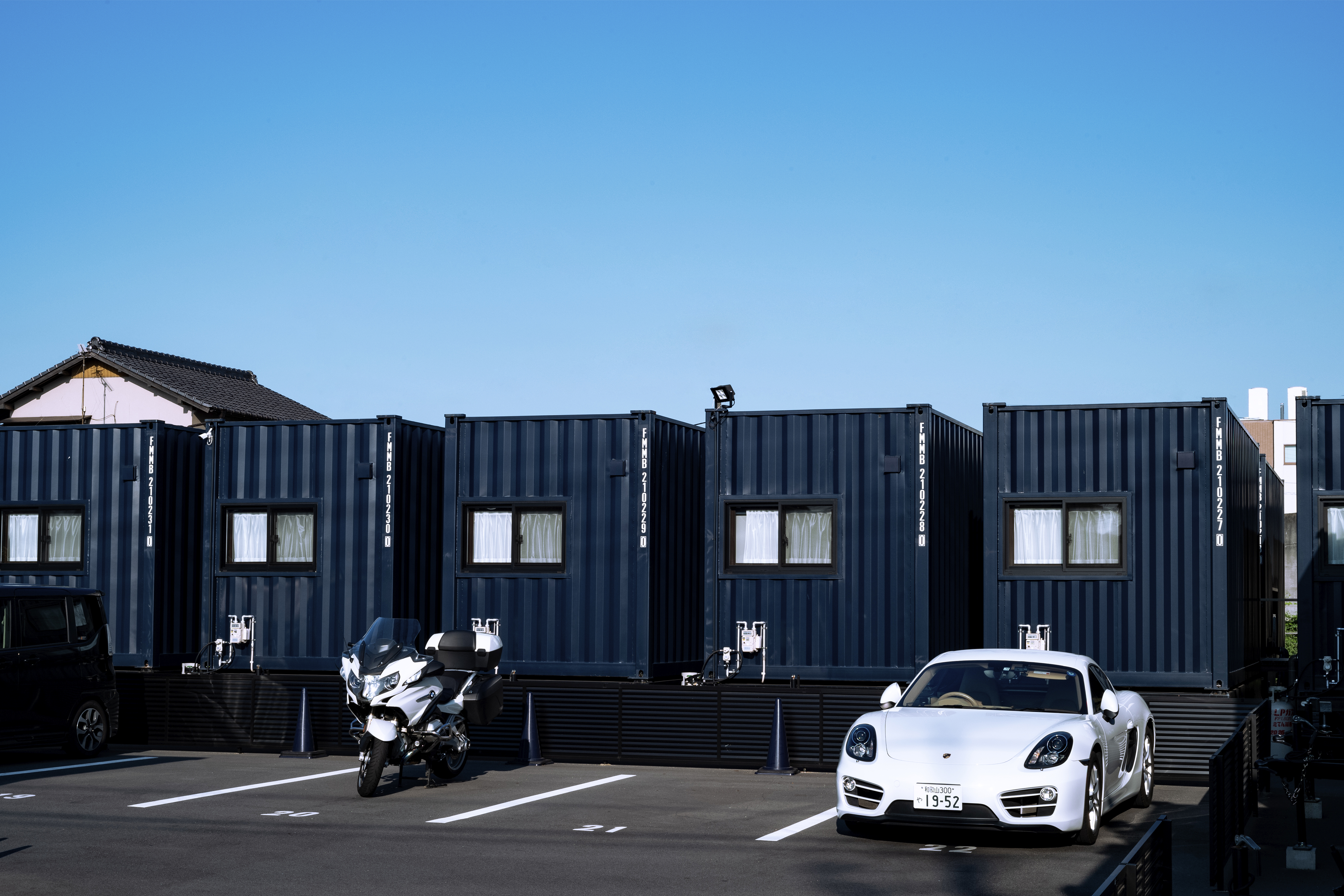
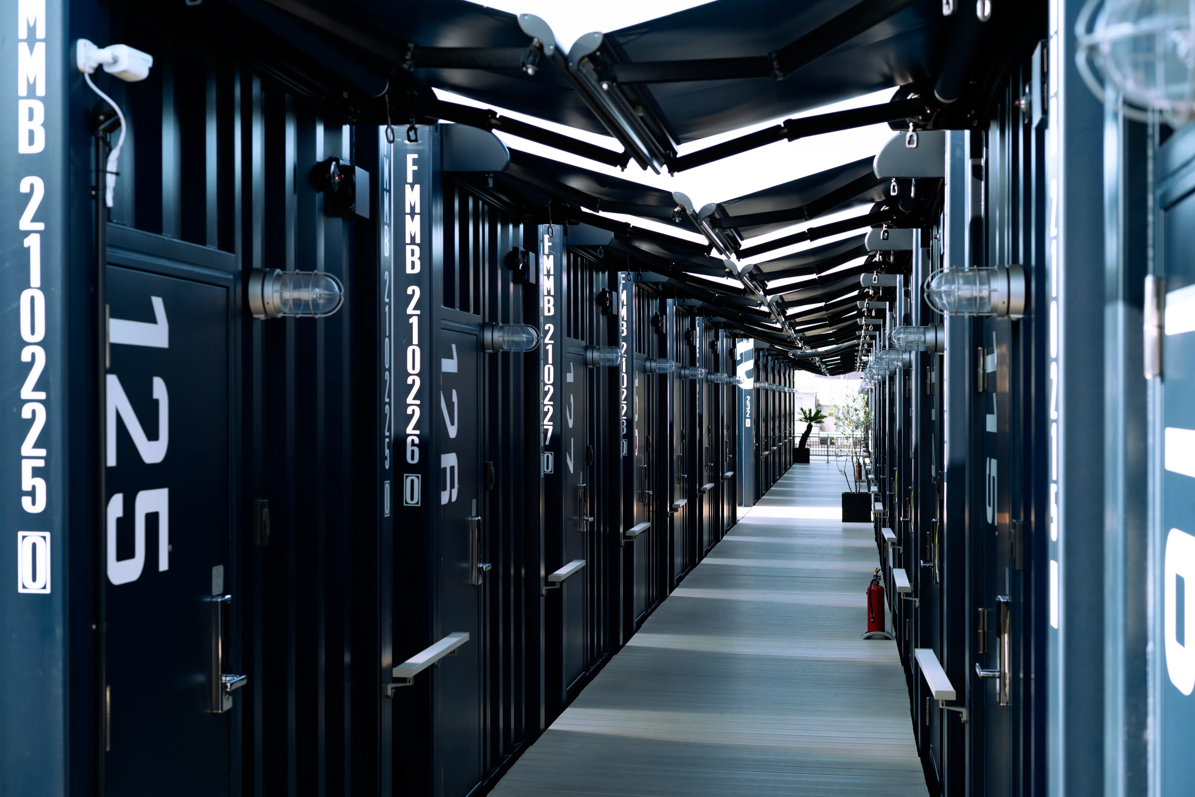
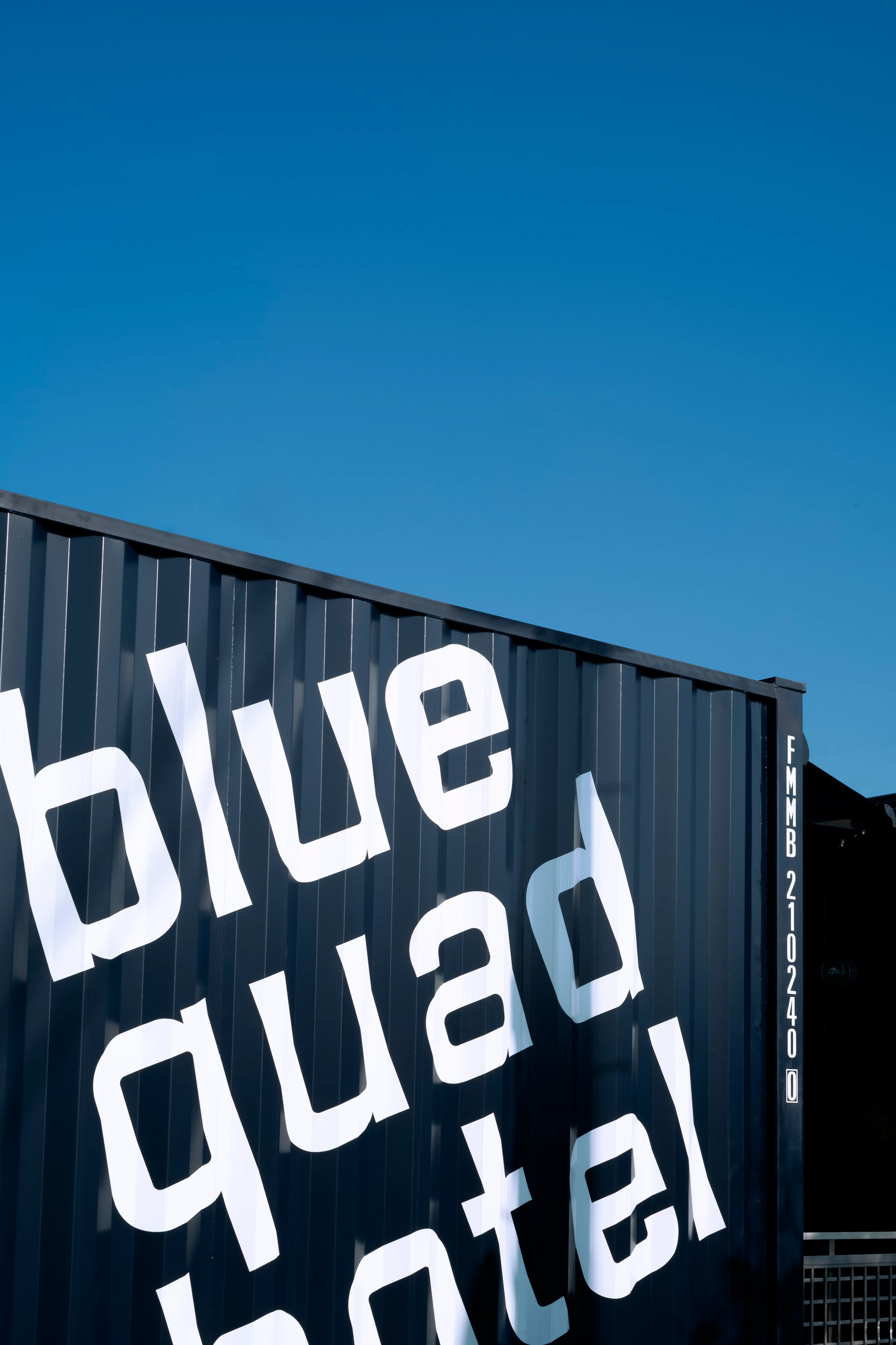
岡山/倉敷に新設されたコンテナホテル「blue quad hotel」のネーミング、ブランドアイデンティティ、サインデザインを担当しました。
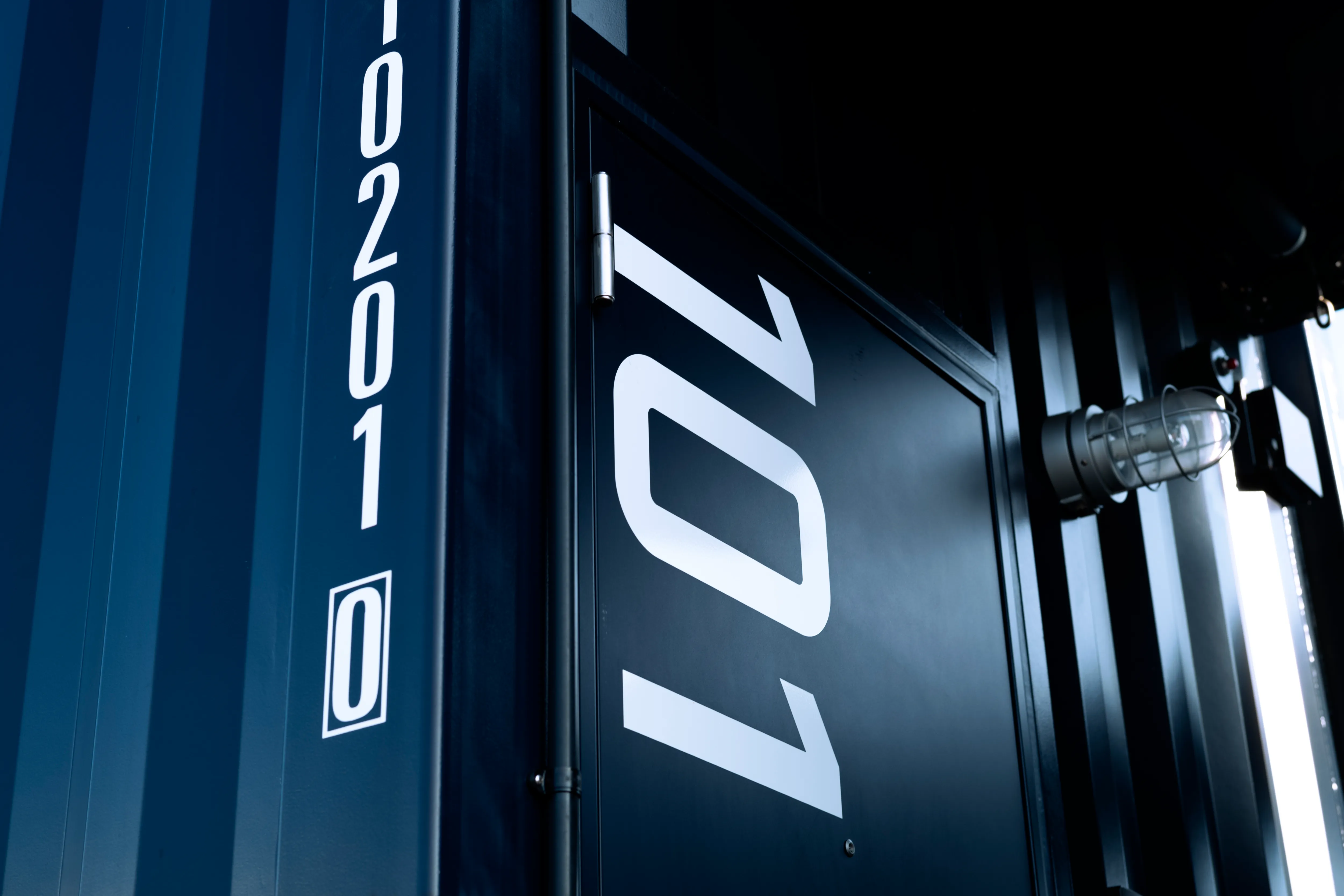
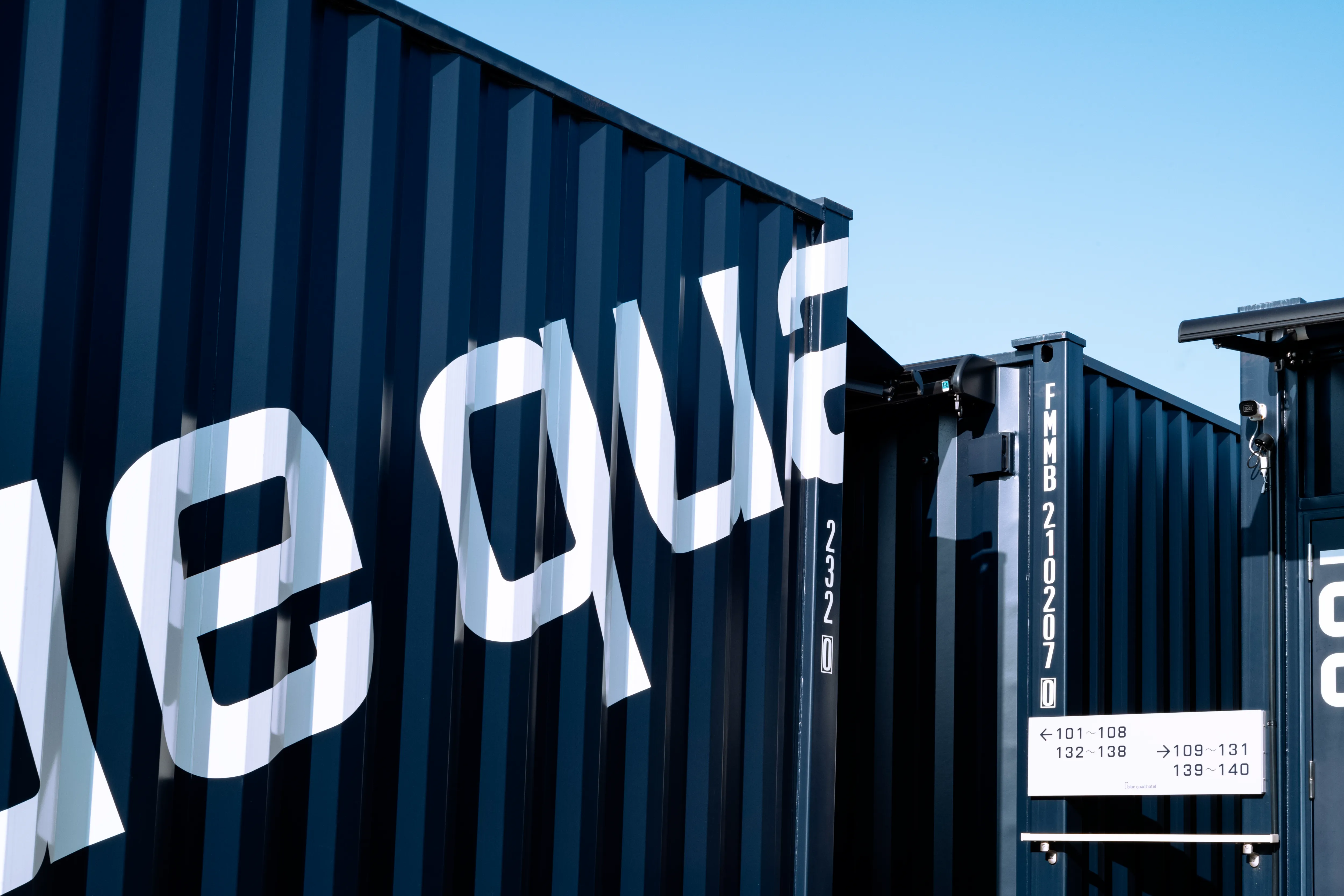
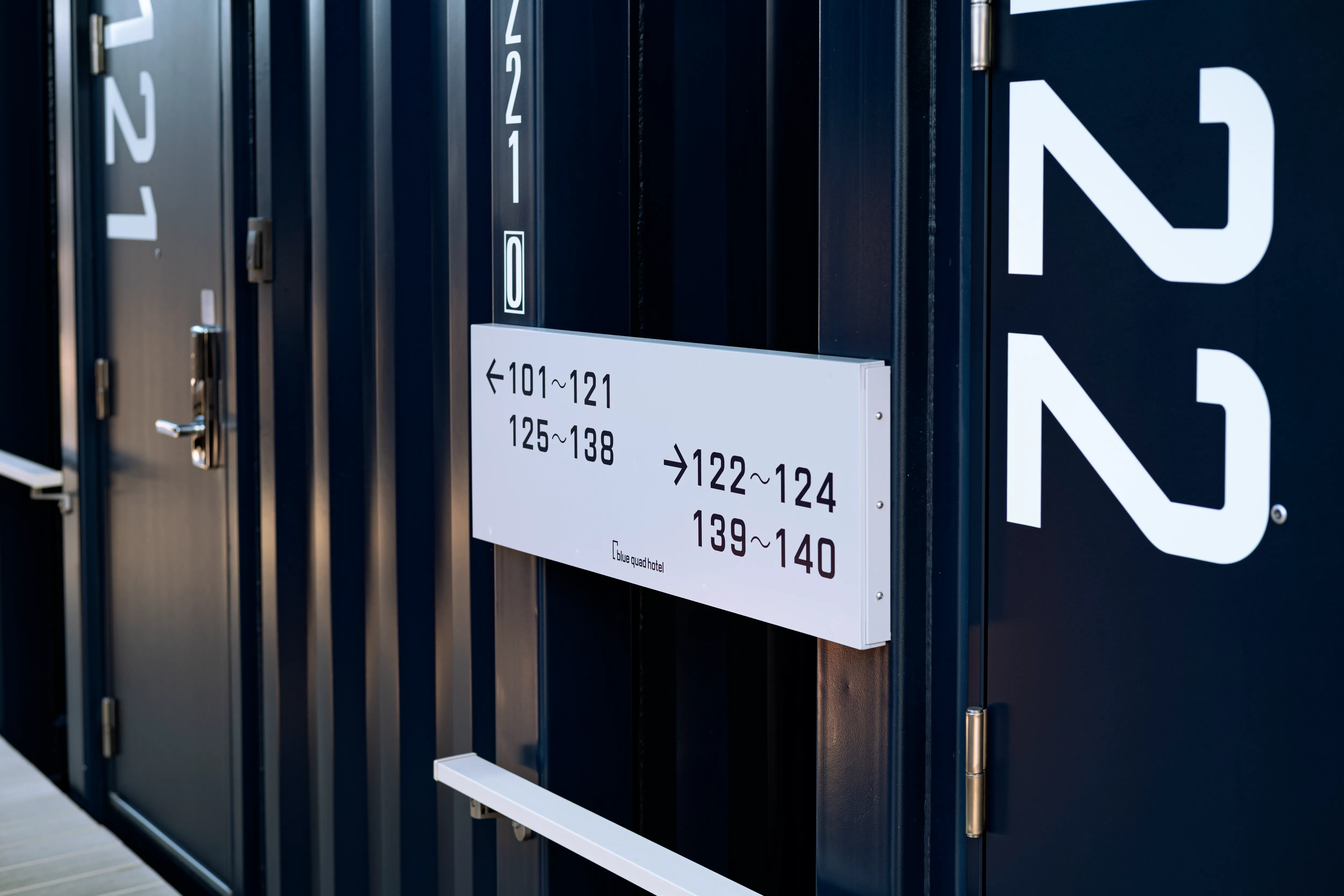
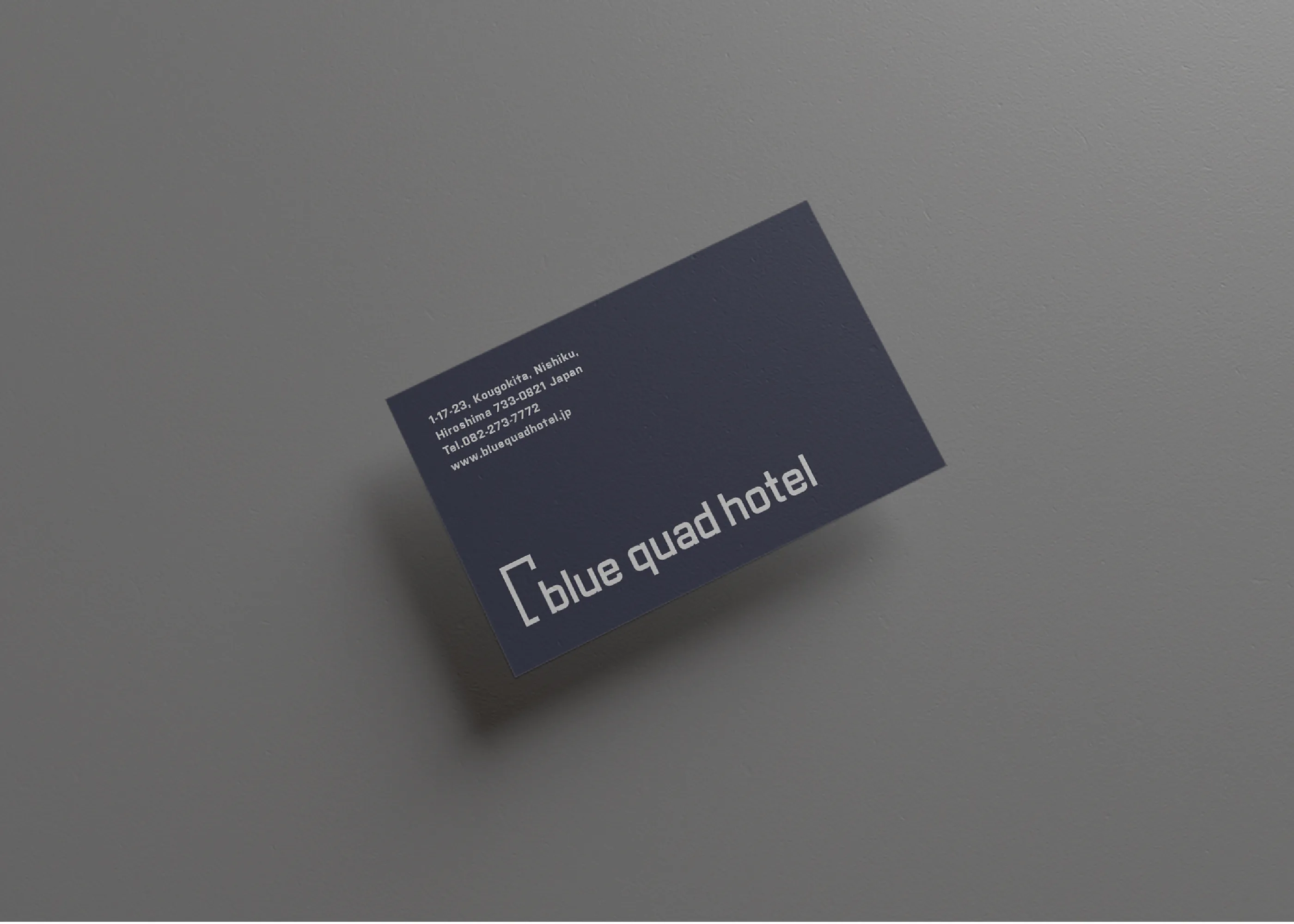
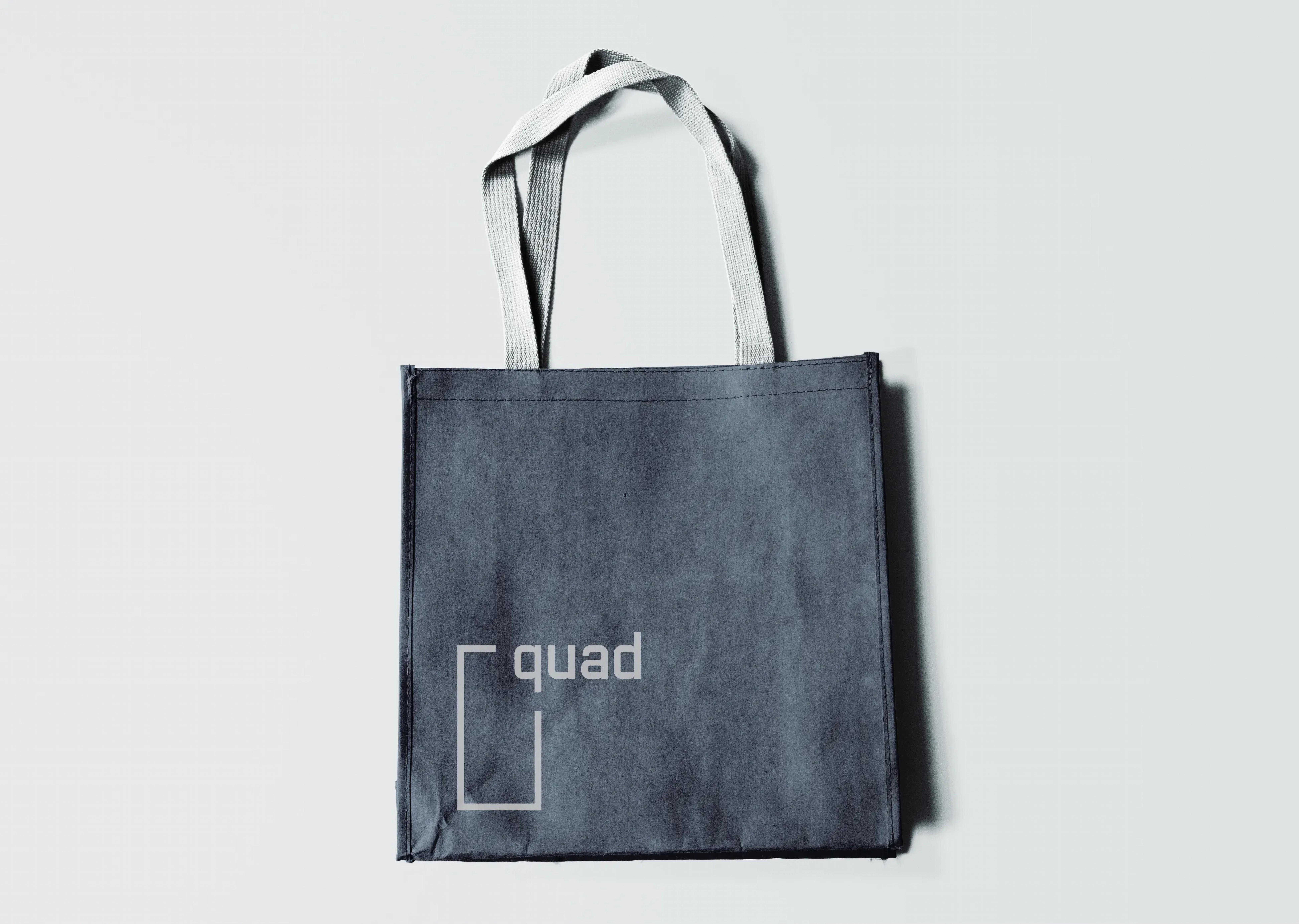
青いコンテナや土地も含めほぼすべてが四角形で構成されており、今回のプロジェクトにふさわしい「quad」(四角形、四辺形)という、覚えやすく発音しやすい、簡潔なワードを選定。ネーミングからインスピレーションを得たオリジナルタイプフェイスは、四角形を意識しながらも、少し丸みがあり、インテリアデザインのカジュアルで柔らかいイメージもあわせて表現しています。シンボルマークは四角形をより際立たせるために、quad の文字のみ使用し、四角の位置はレイアウトによって可変するシステムとなっています。カラーは、建築/インテリアデザインから抽出した、ネイビーブルーとダークグレー、サブカラーにホワイトを設定し、上記要素をサインデザインへも落とし込んでいます。
We designed naming, brand identity, and signage design for a new hotel "blue quad hotel" in Kurashiki, Okayama.
Including the blue containers and the land, is made up of squares, and we selected the word "quad" (quadrilateral, quadrilateral), a concise word that is easy to pronounce and remember, as it is suitable for this project. The original type face, inspired by the naming, is square in shape, but slightly rounded to express the casual and soft image of the interior design as well. The symbol mark uses only the word "quad" to emphasize the square, and the position of the square is variable according to the layout. The colors are navy blue, dark gray, and white as sub-colors extracted from architectural and interior design, and the above elements are also incorporated into the signage design.
Naming, graphic design and signage design: Kazuki Kaneko, one inc.
Creative direction and design direction: Ai Yoshida, etc inc.
Interior design: SUPPOSE DESIGN OFFICE