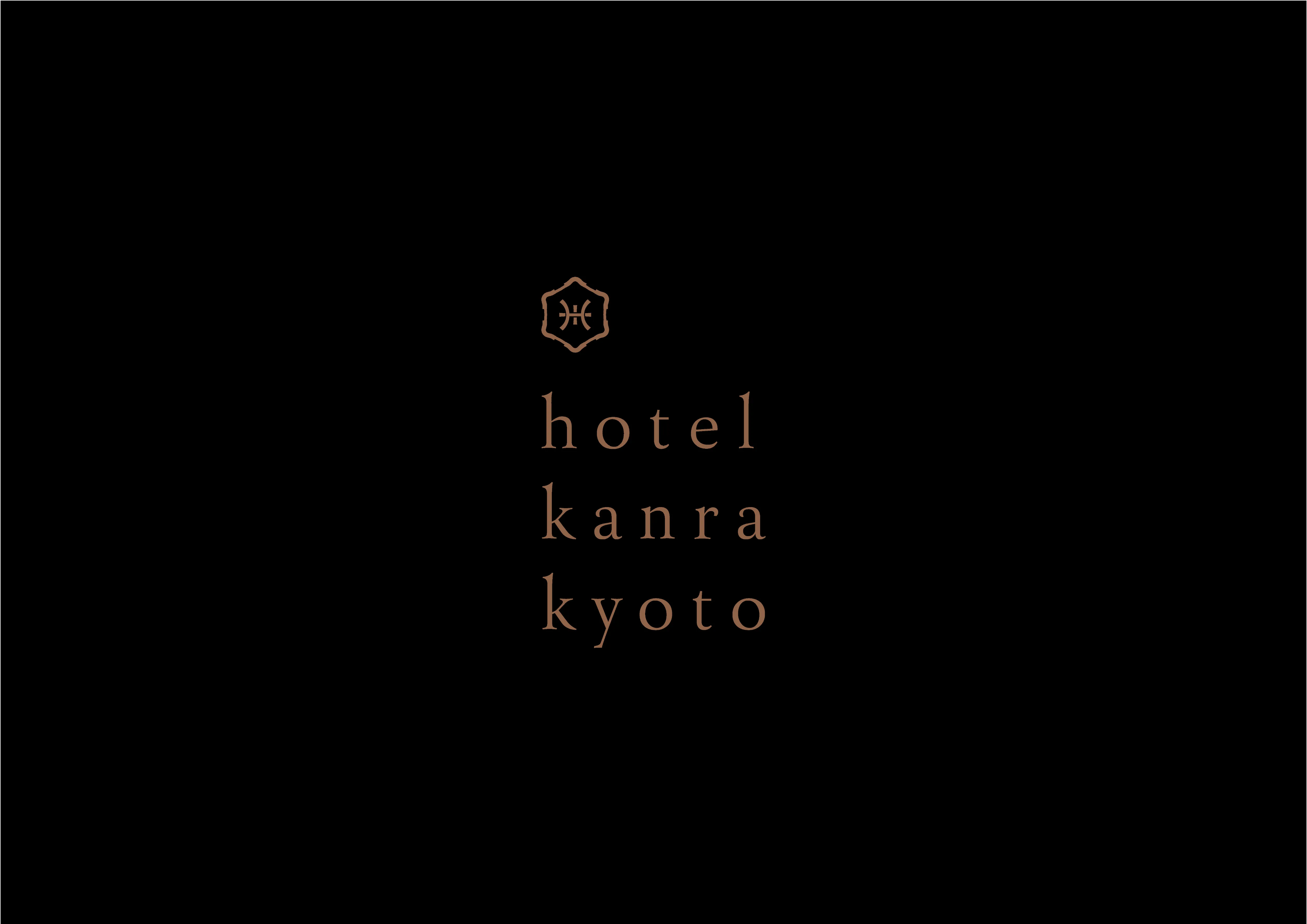
hotel kanra kyoto
Brand Identity / Graphic Design / Typeface / Wayfinding
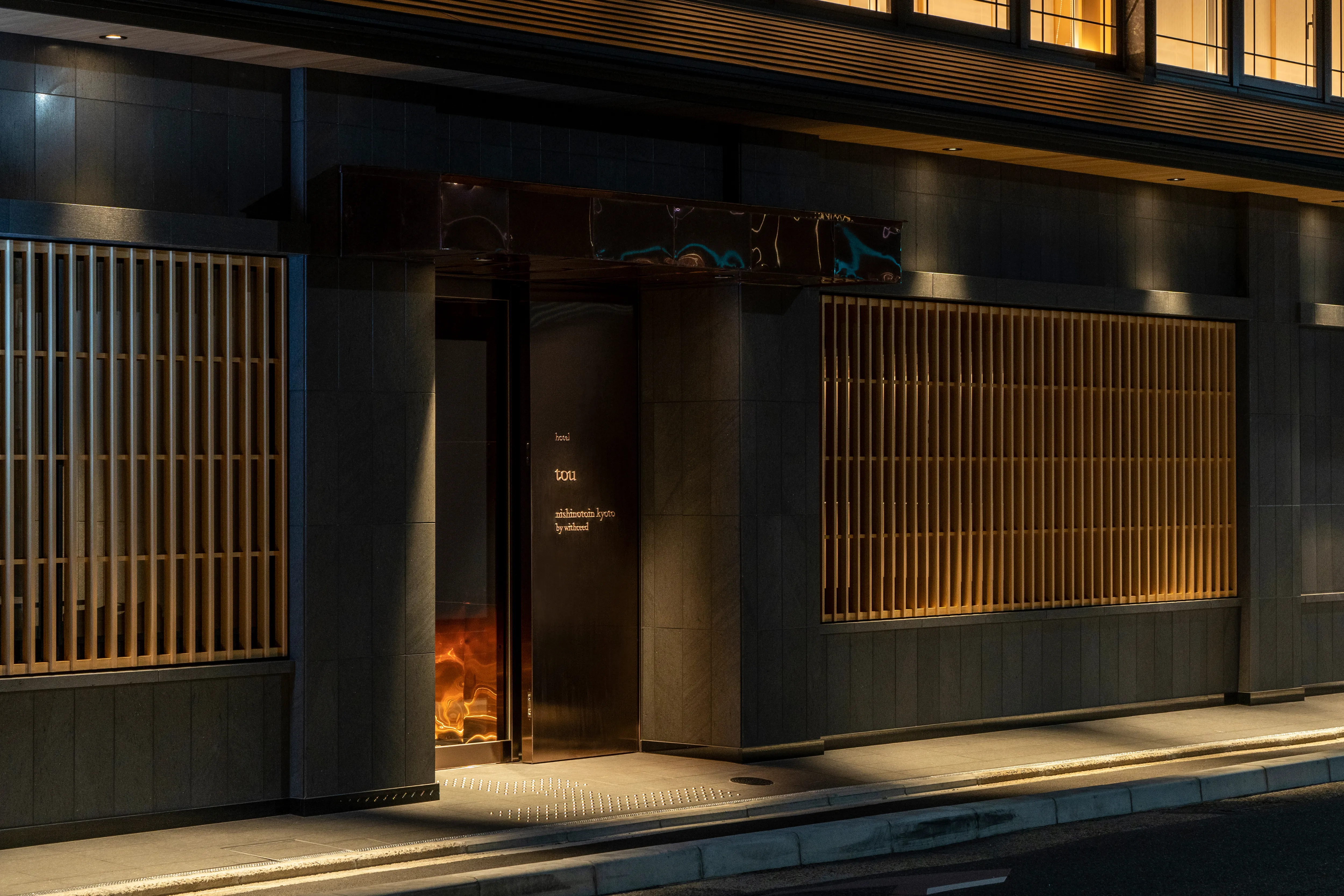
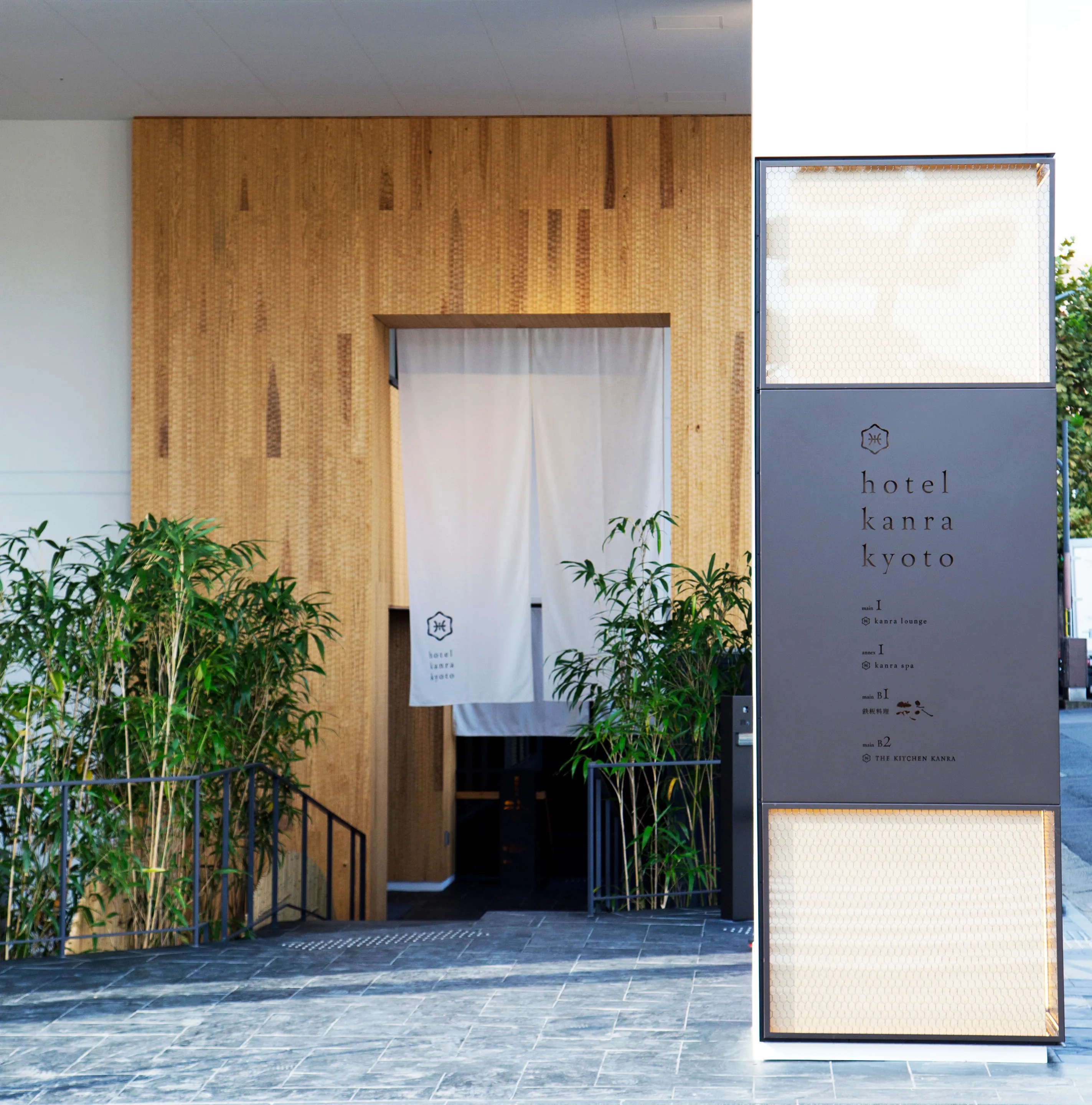
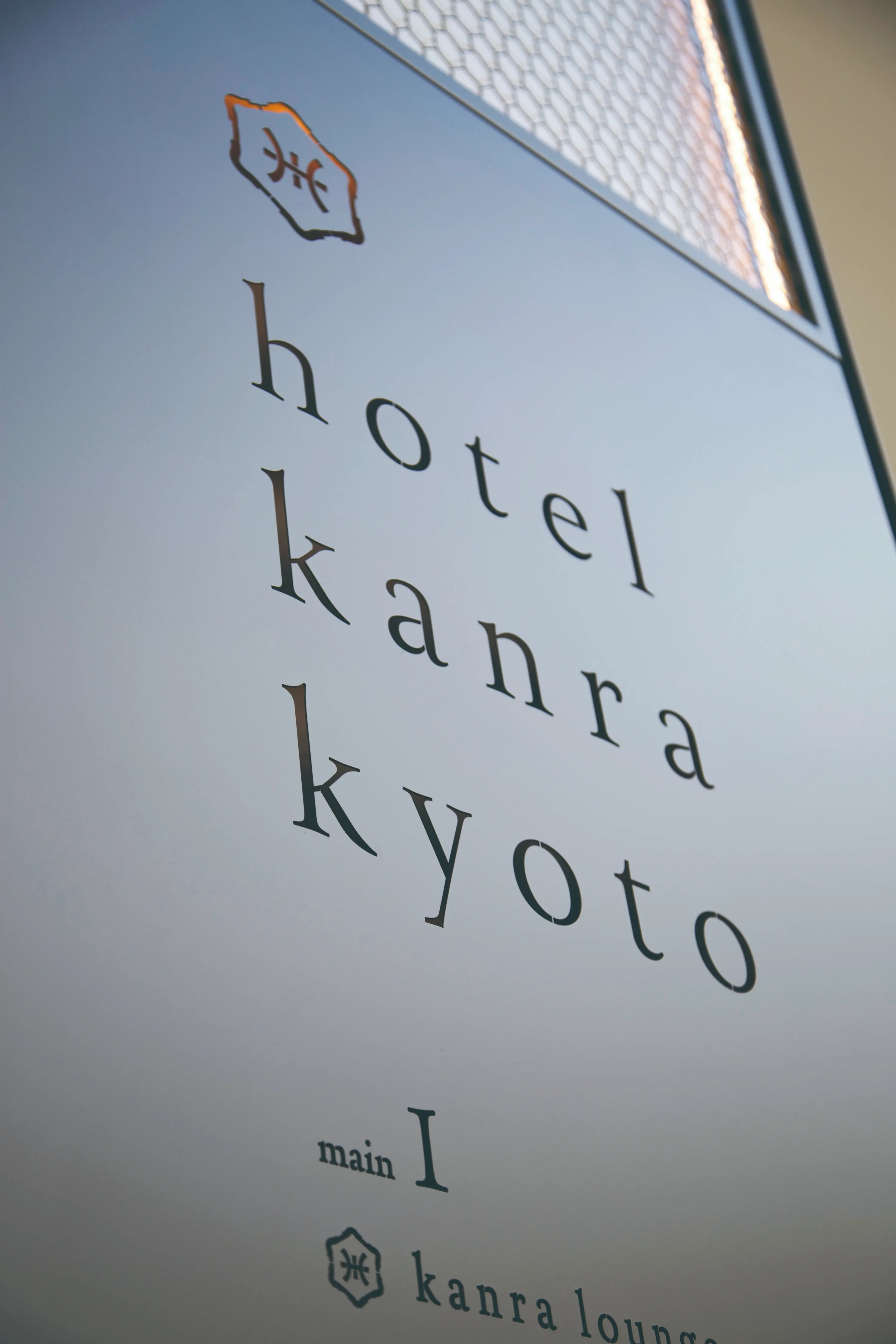
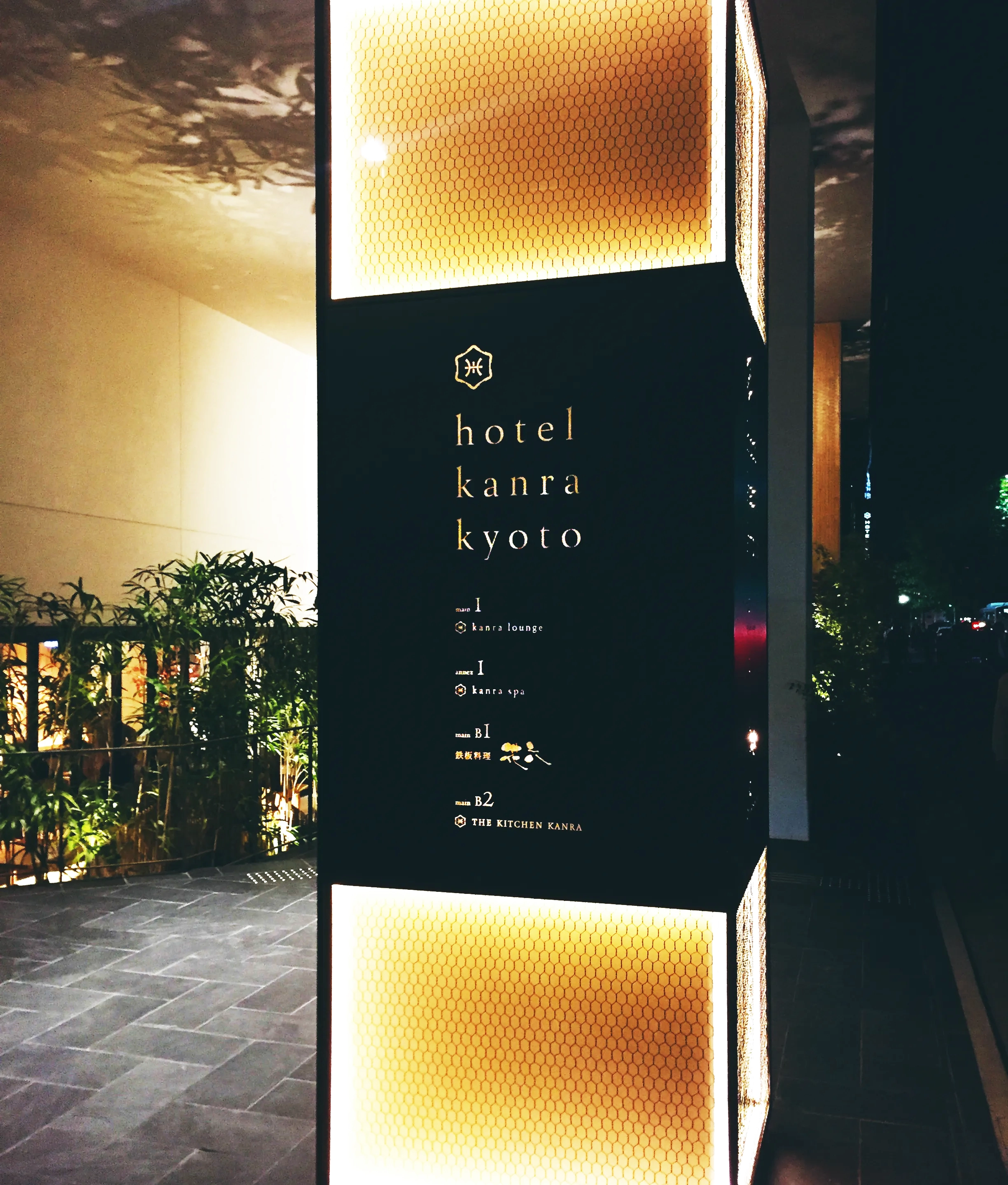
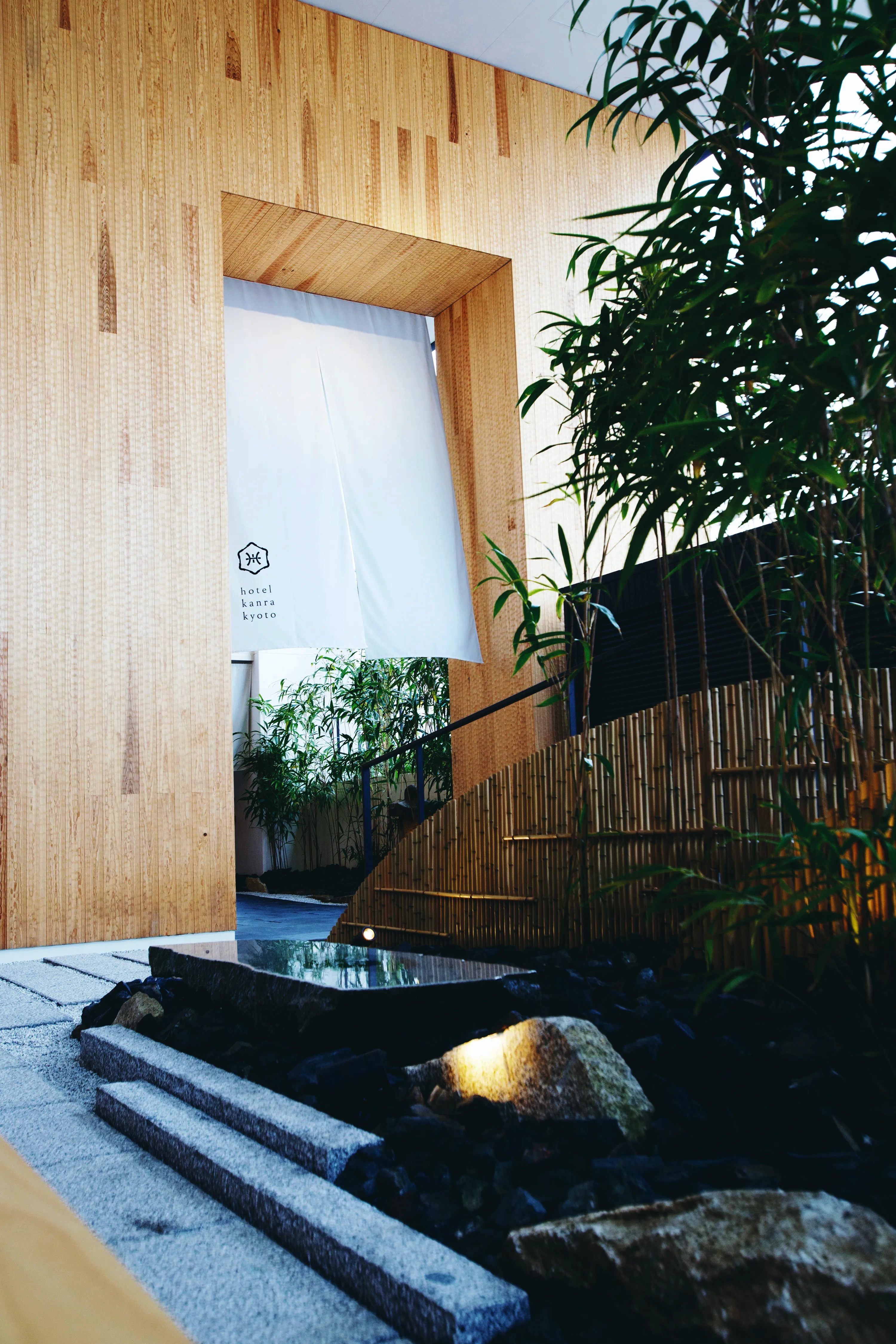
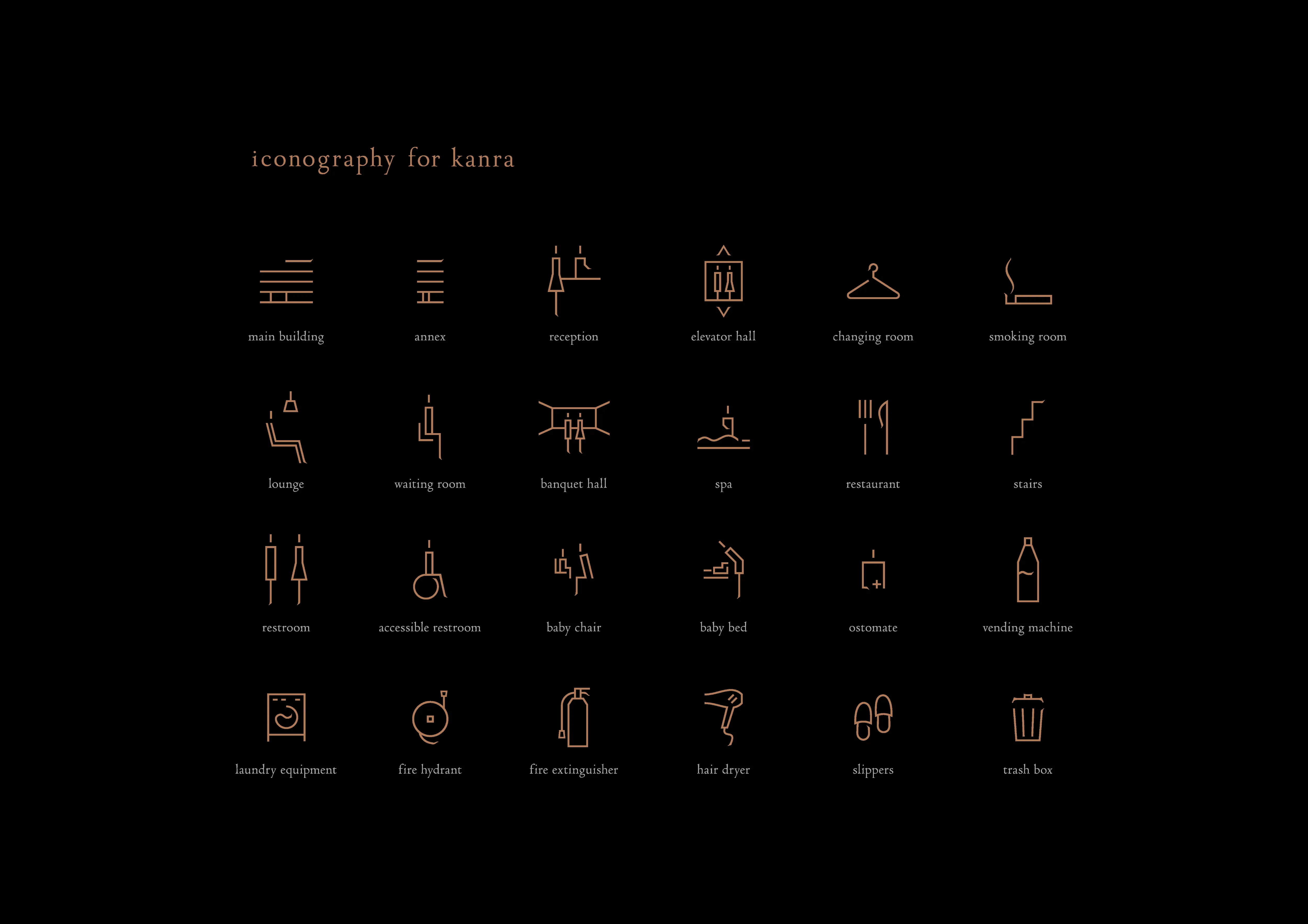
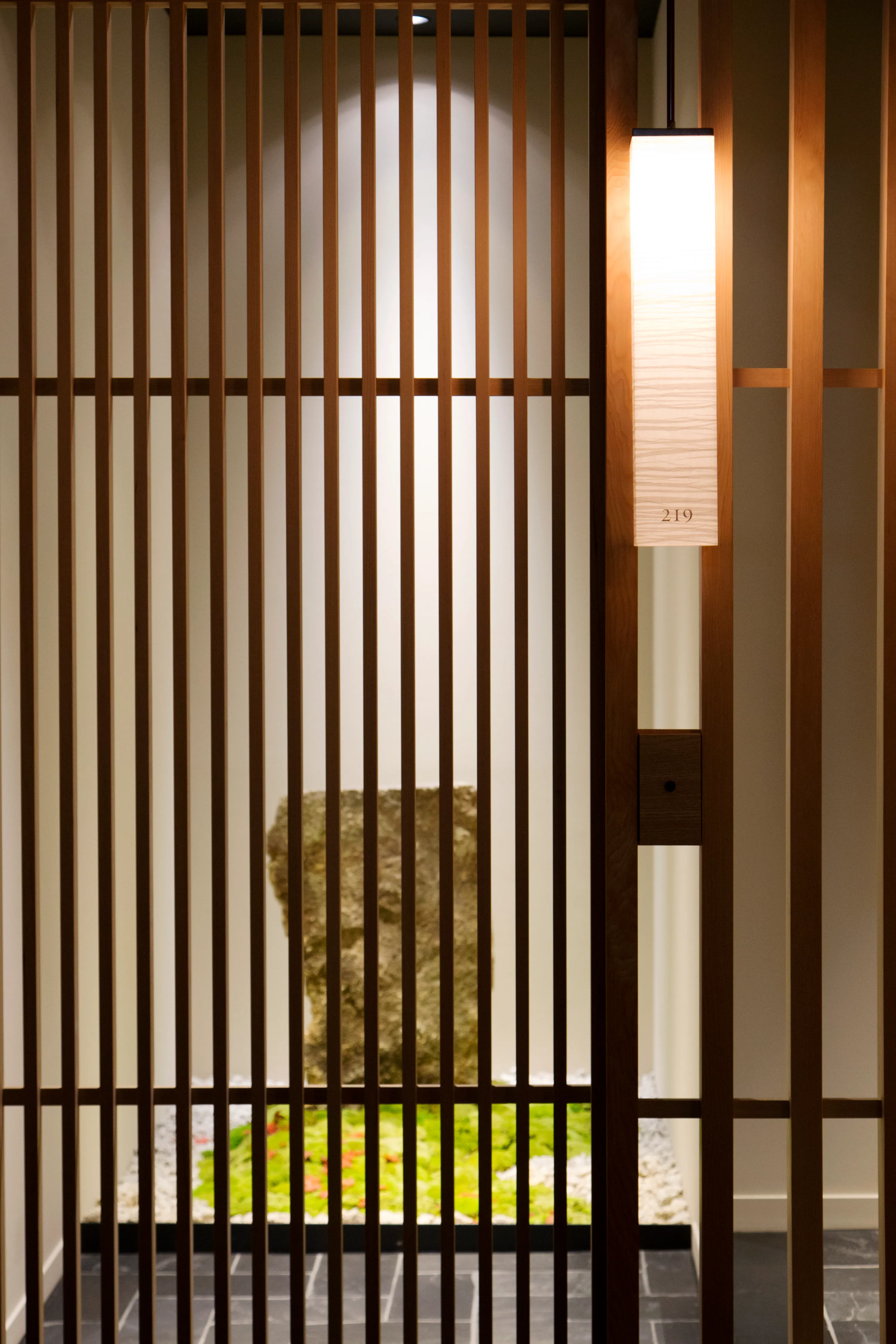
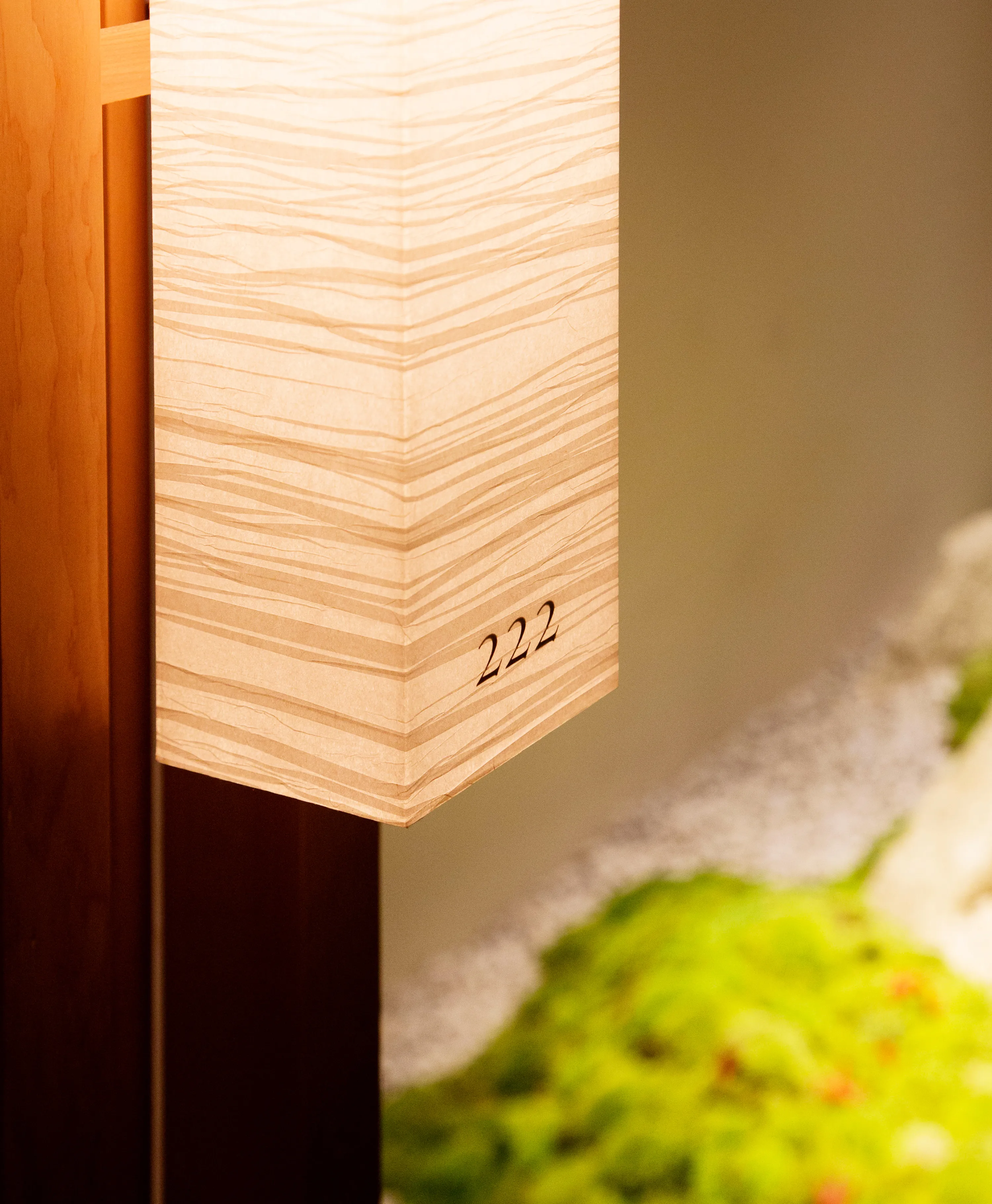
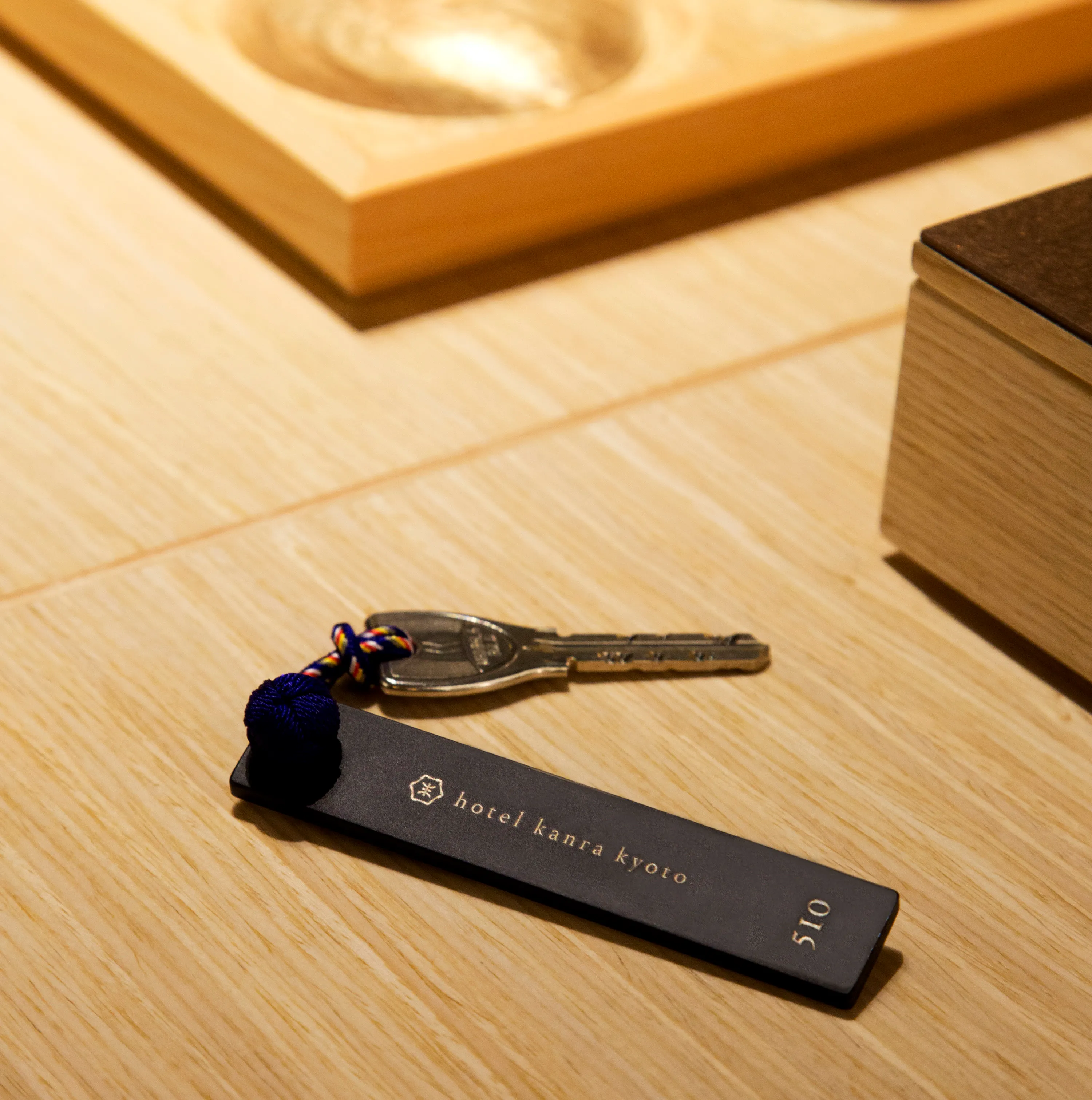
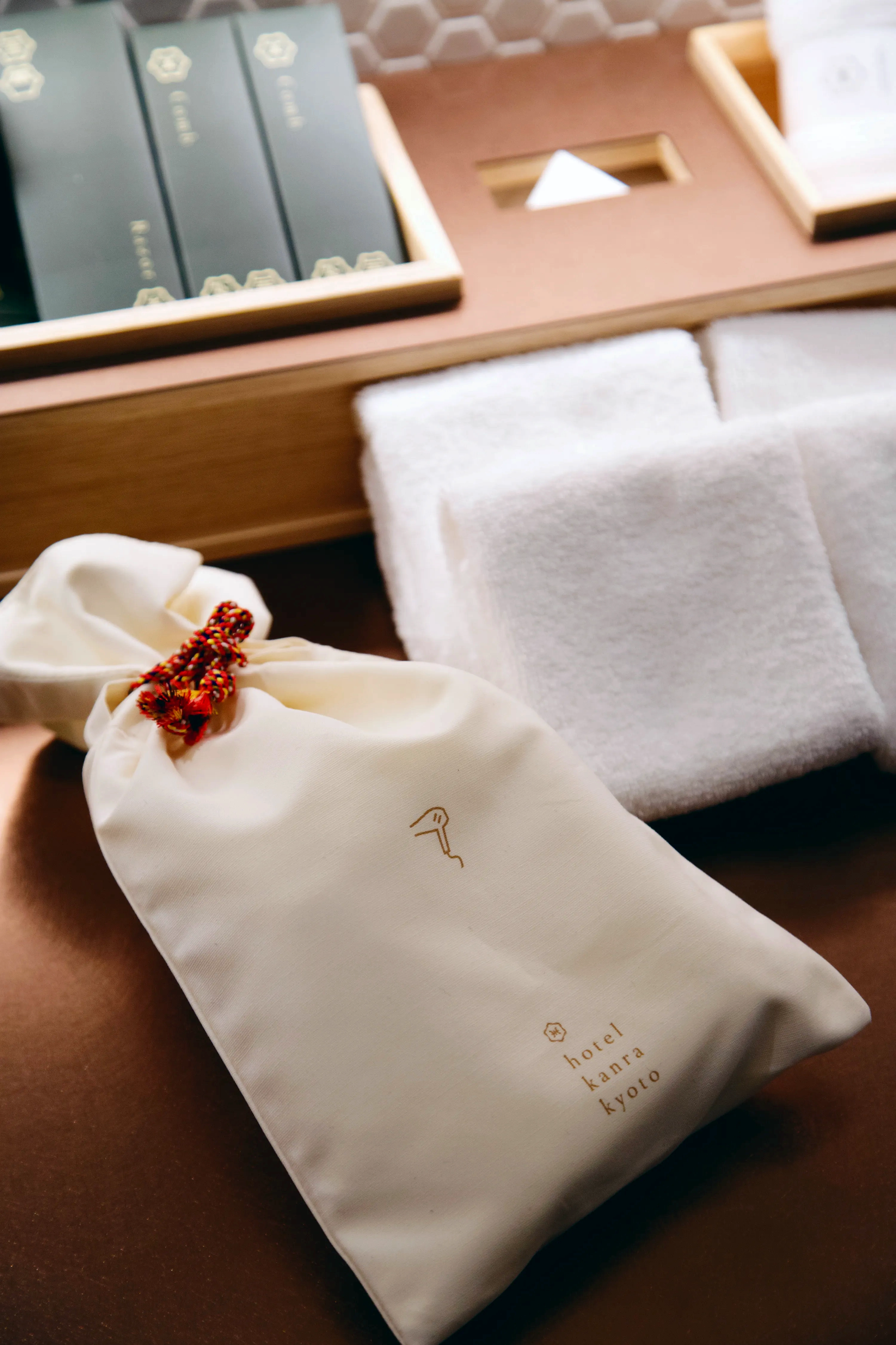
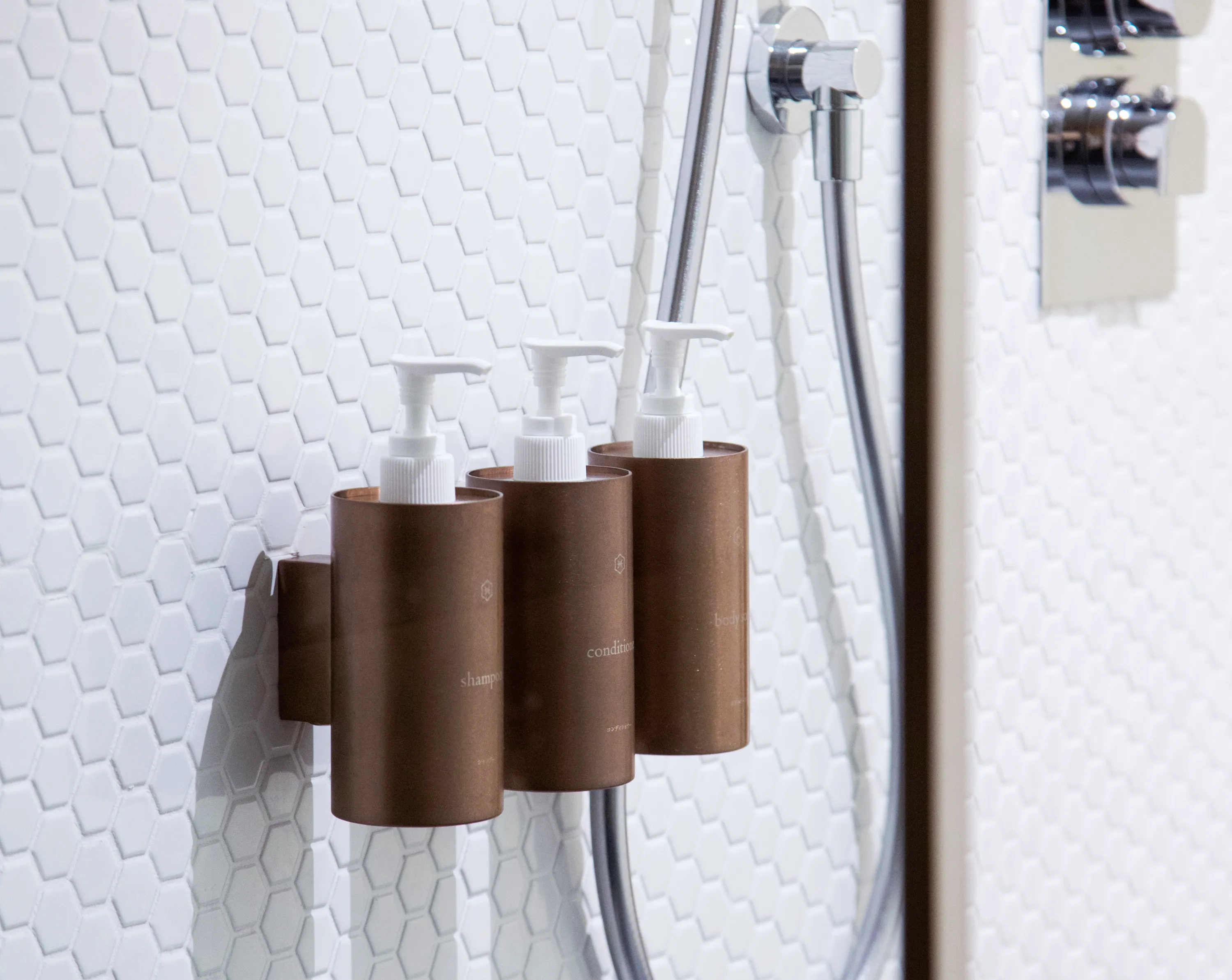
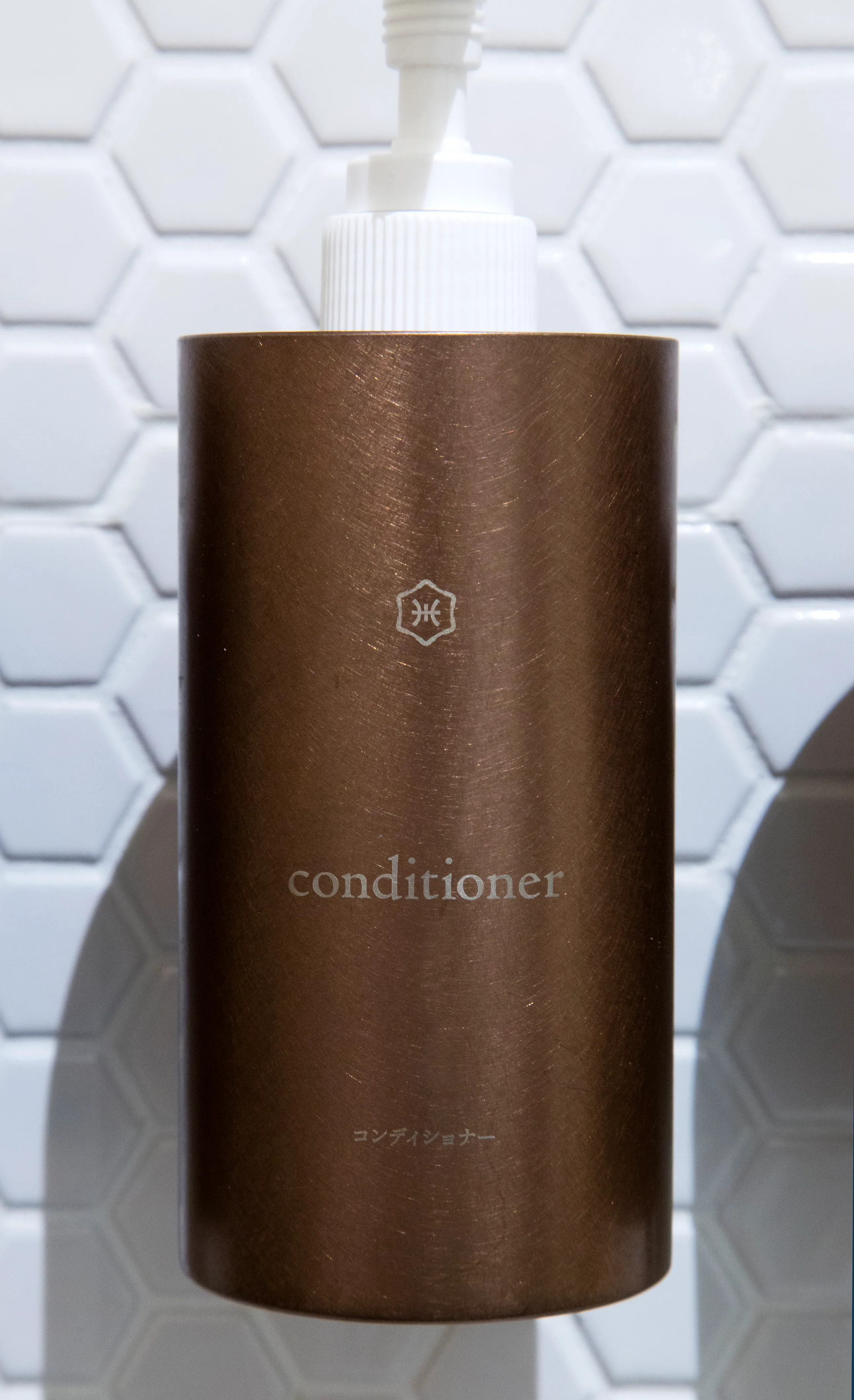
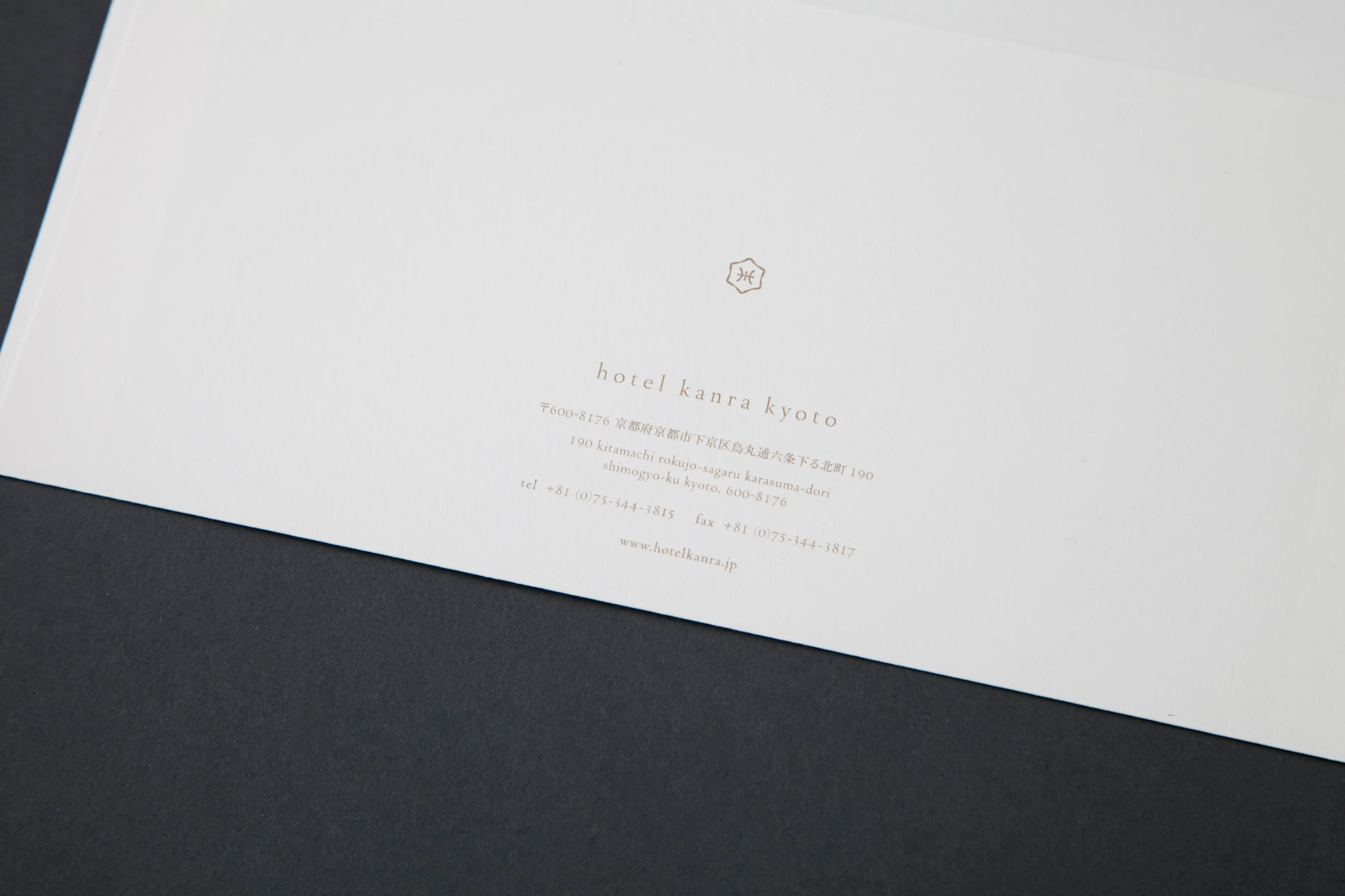
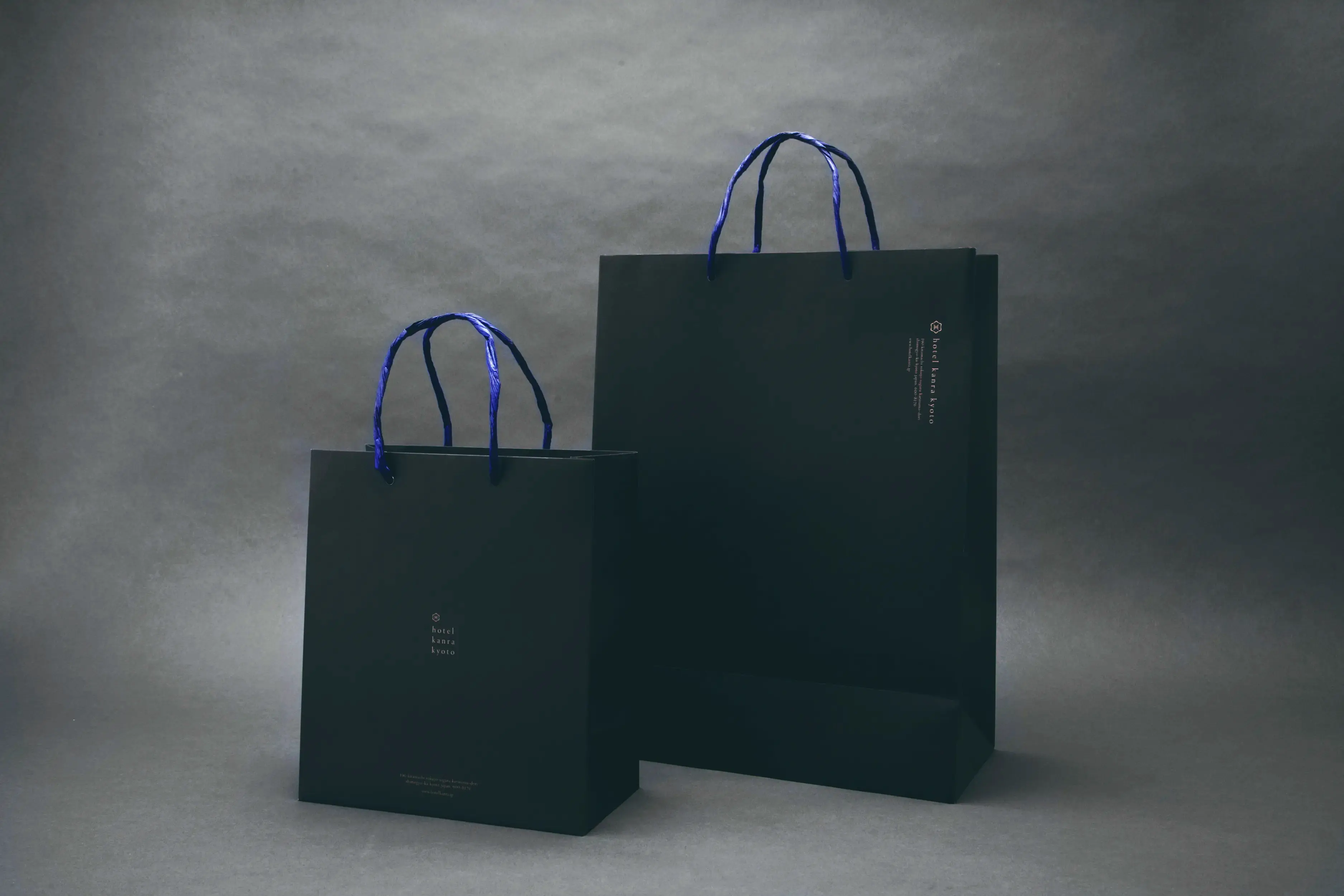
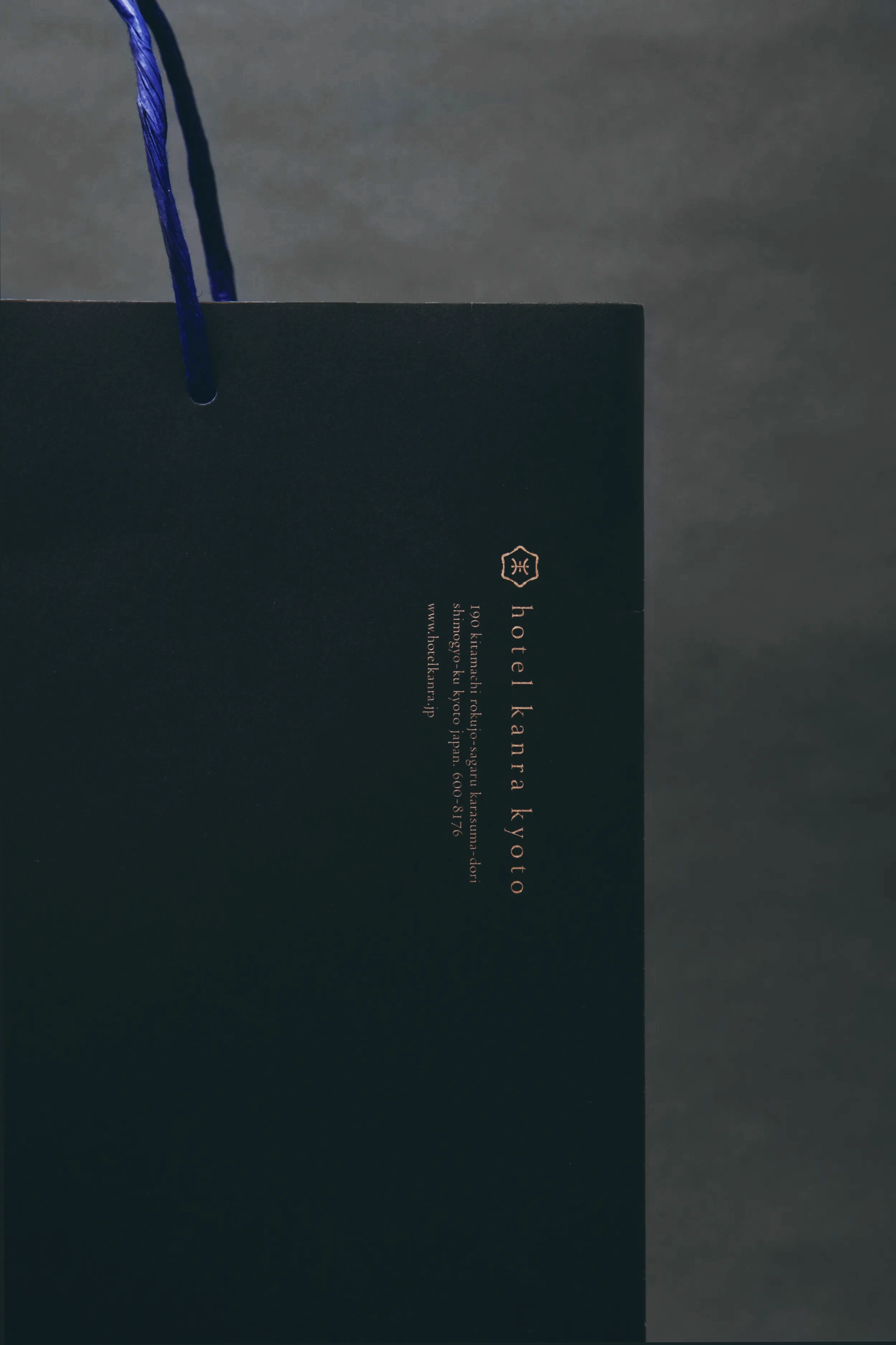
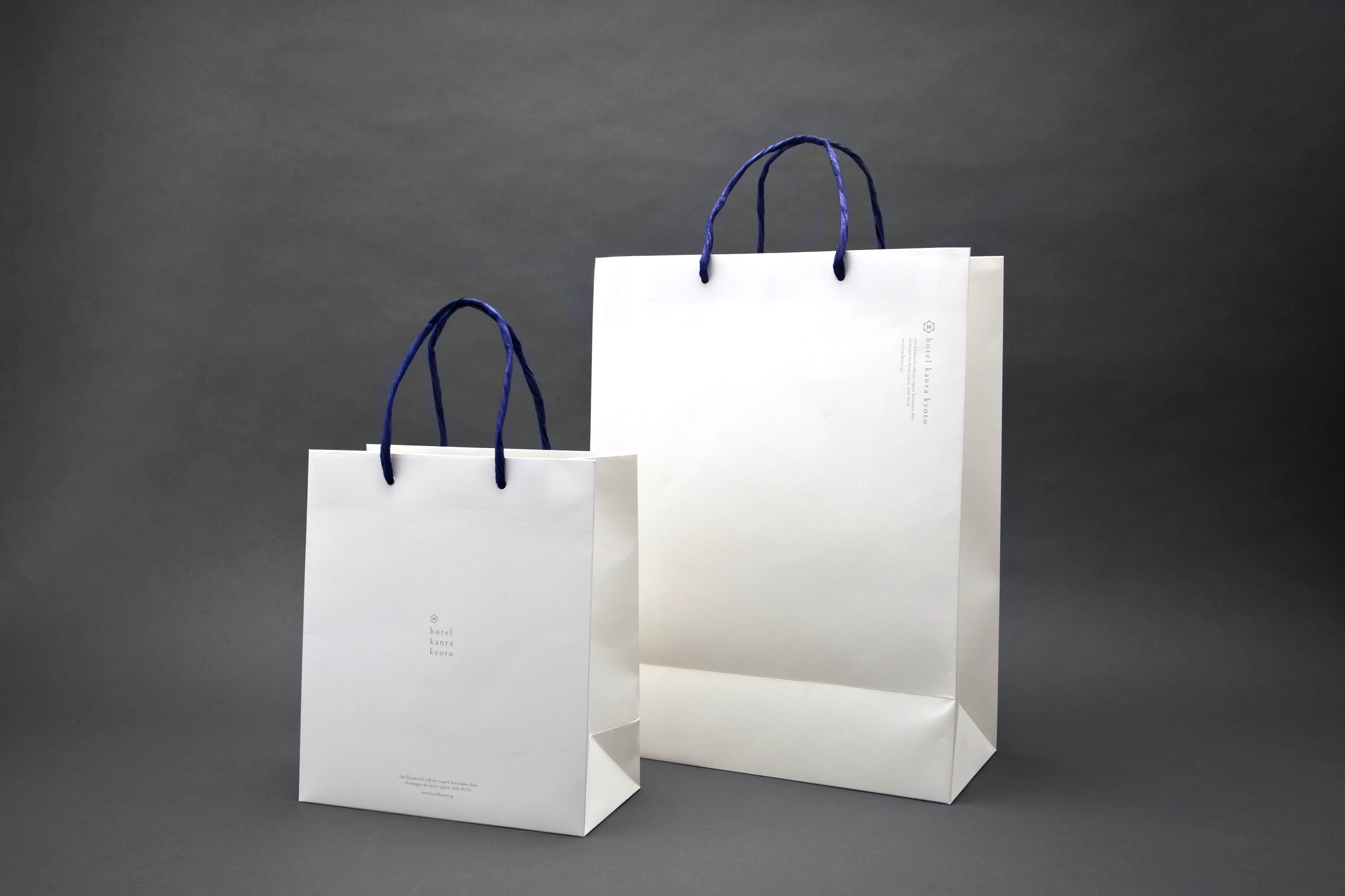
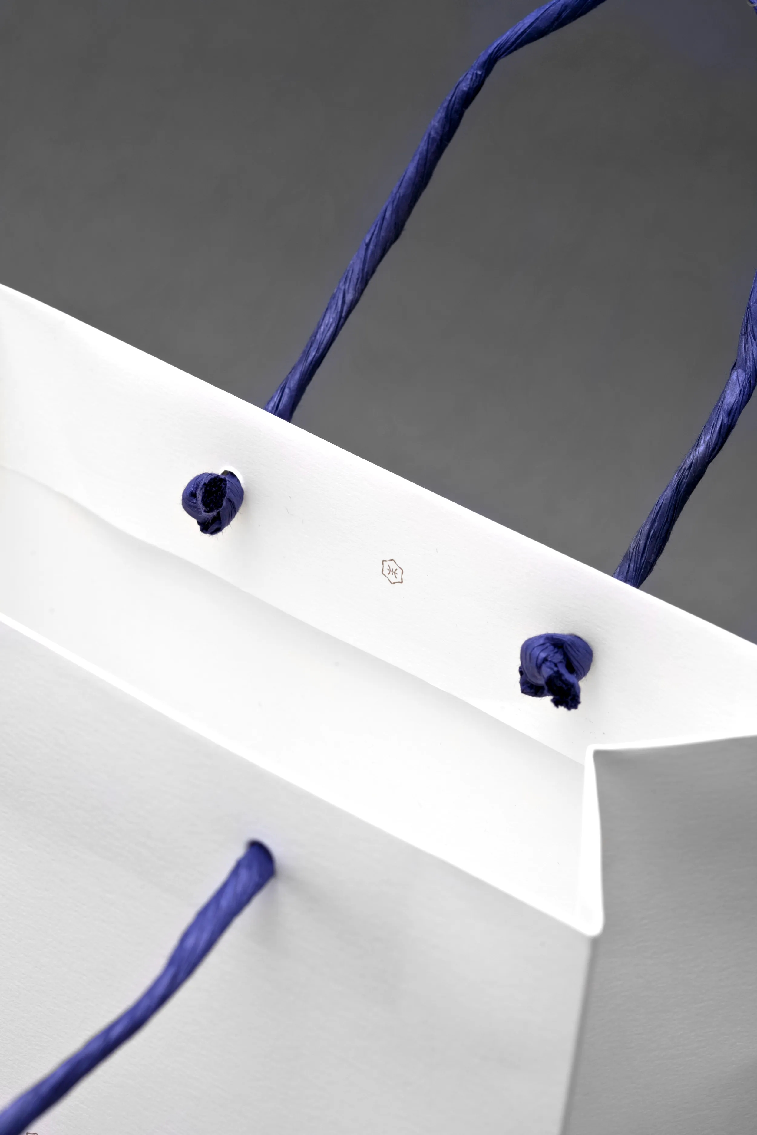
日本/京都の持つ美意識と上質な佇まいから、デザインコードを「綺麗さび」とし、ロゴタイプ、基本書体/アイコン、少しエイジングのかかった漆黒・銅赤色をサイネージや印刷物に採用するなど、ブランドカラーを設定。ロゴからグラフィック、サイネージまで包括的にブランドデザインをしています。
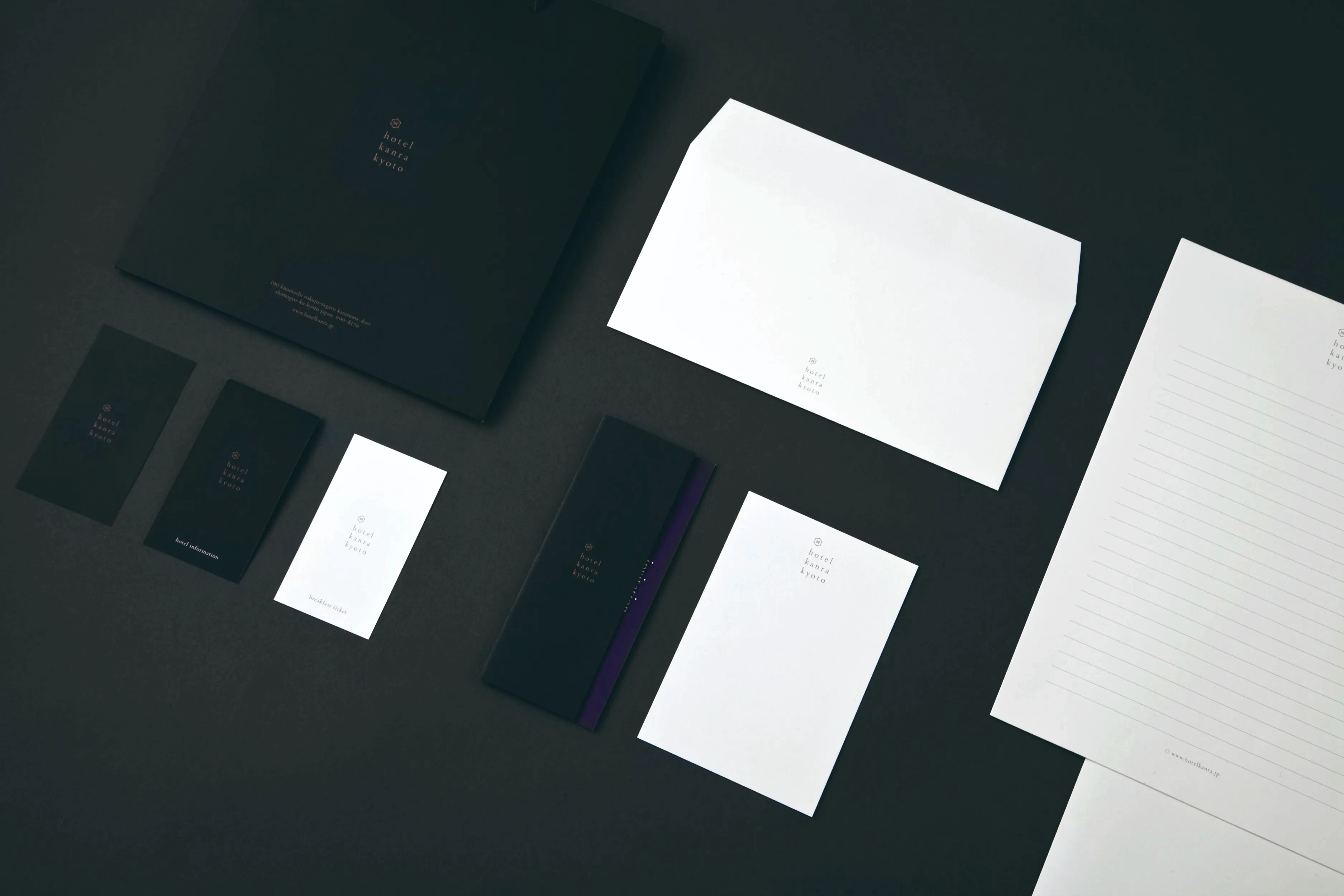
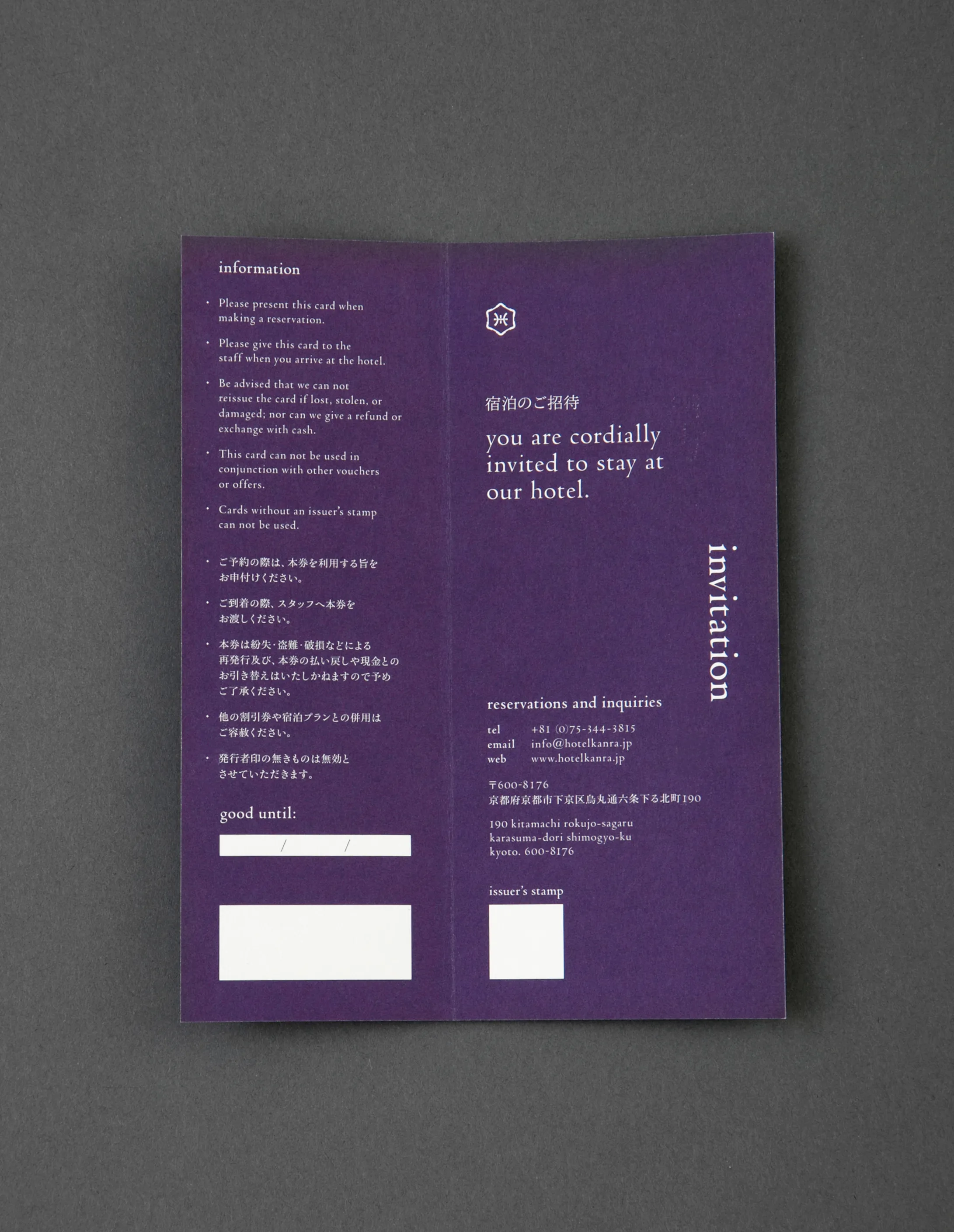
日本の伝統文化を感じられる要素を各所に散りばめながら、グローバルとローカルの2つの視点を大切に、全てのデザインを英語と日本語のバイリンガル表記とし、インターナショナルを意識したトーンアンドマナーで新しい hotel kanra kyoto のブランドイメージの構築を目指したプロジェクトです。
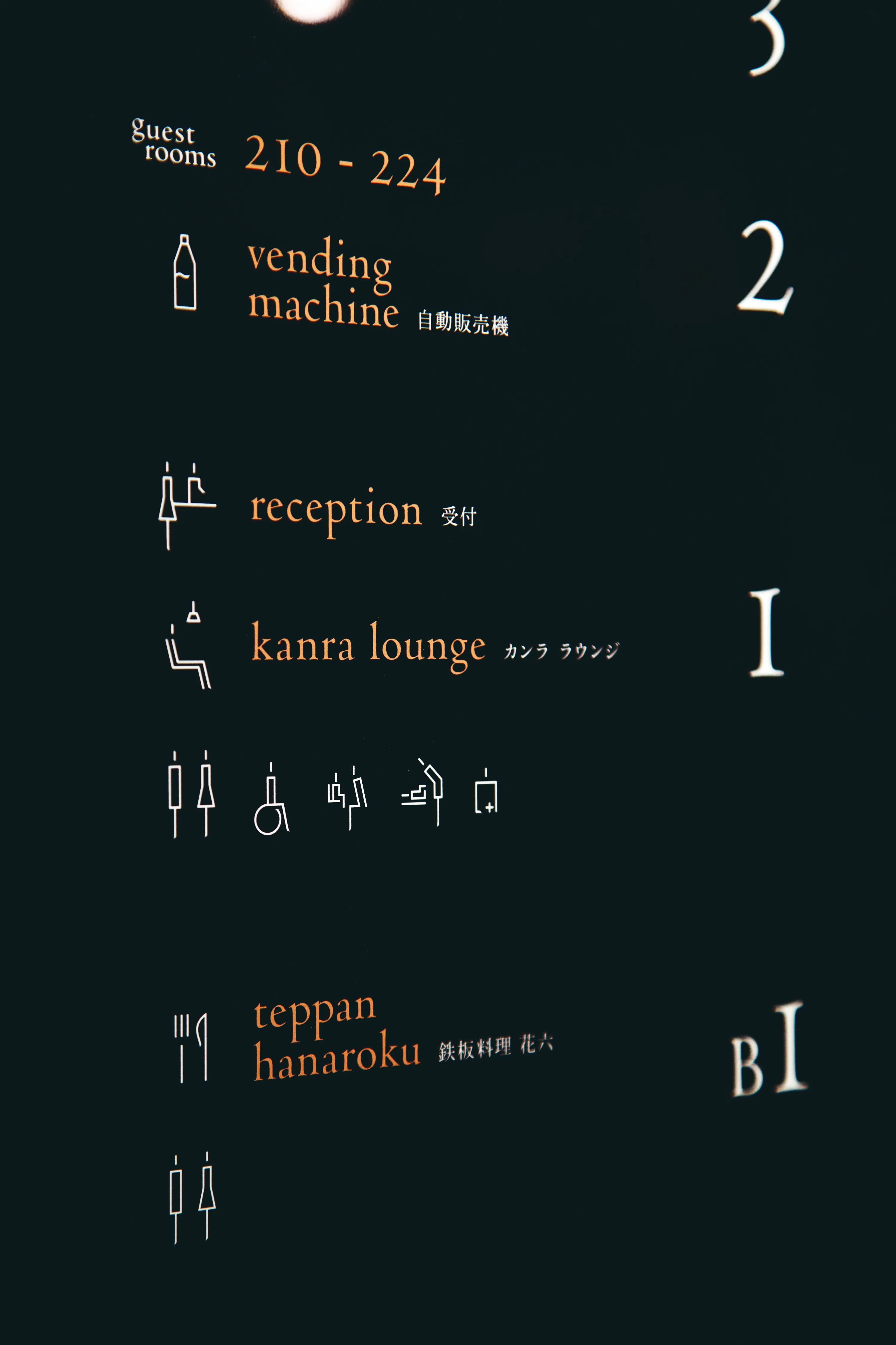
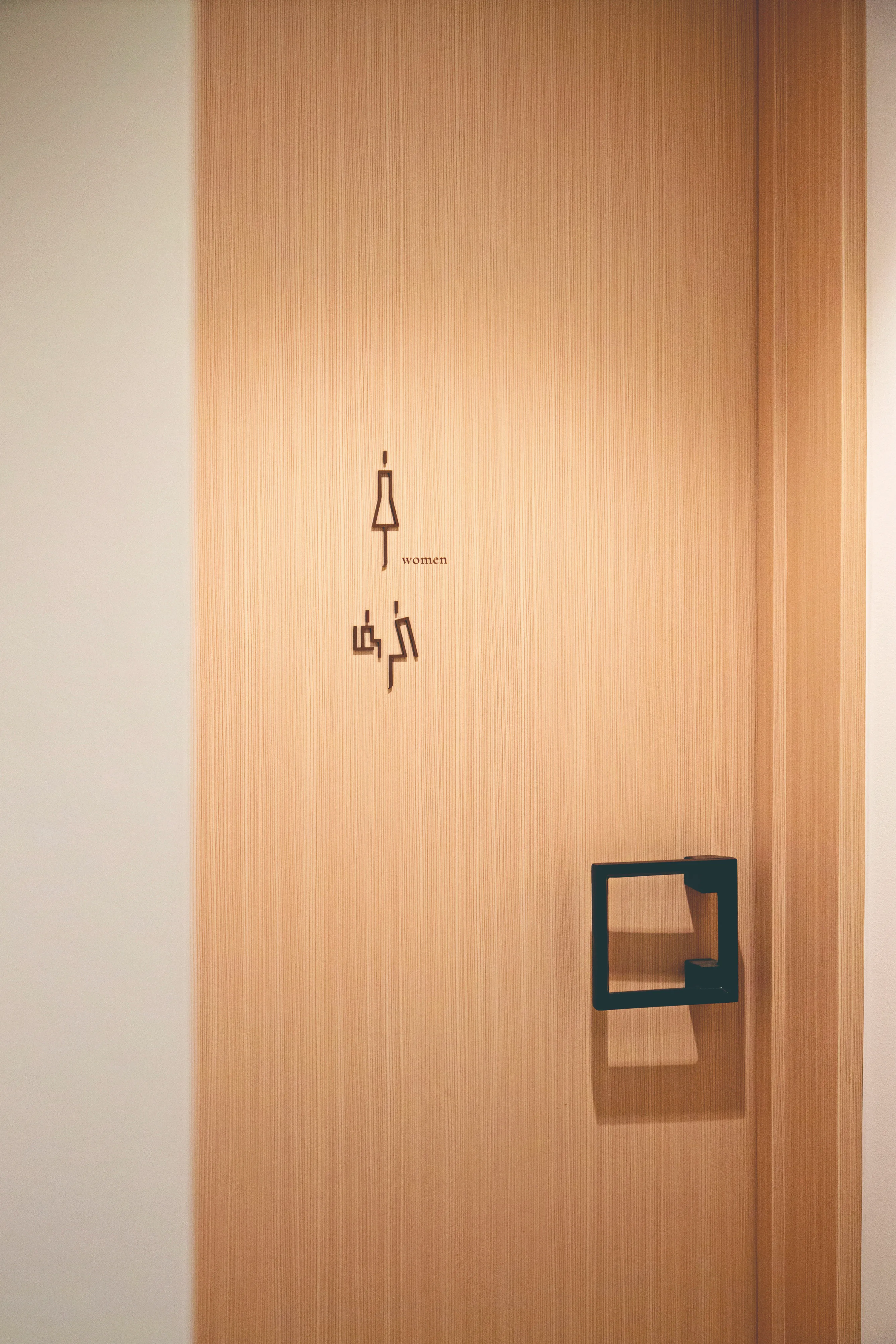
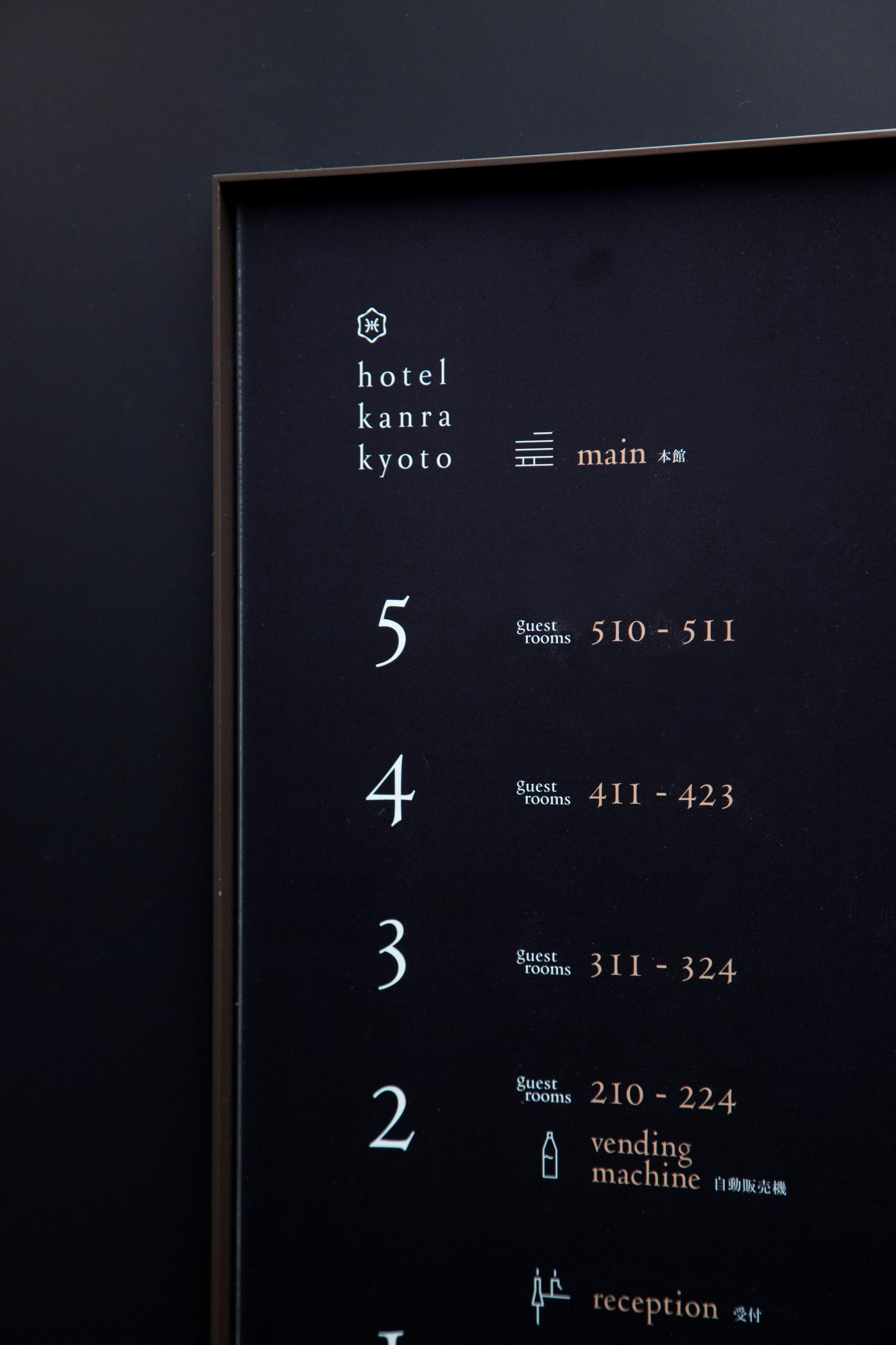
The design tenet for this project was ‘Kirei-sabi’, an aesthetic sense and philosophy of kyoto/japan, which was realized through the logotype, typography, pictograms, and the tastefully weathered color scheme of coal black and copper red that were used in the signage and print materials.
While elements of traditional Japanese culture are present in all levels of the design, to meet demands of a growing inbound market in kyoto, all written materials are in both Japanese and english. our goal for this project was to build a new brand image of ‘hotel kanra kyoto’ that is international in scope with a Japanese essence.
Produce, brand concept, architecture and interior design: UDS ltd.
Branding: artless inc.
–
Creative direction and art direction: Shun Kawakami
Design: Shinsaku Iwatachi
Symbol design: Emmi Narasaki, Styledesignworks
Photography: Yuu Kawakami
Client: UDS ltd.
Art direction, design and project management: Kazuki Kaneko
As a member of artless Inc.